Solar System Simulator PC Review
Summary: An interesting concept marred by poor usability.
2.8
Sterile Space
One of my favourite trips as a child was to the planetarium. I used to love the immersive experience of watching the stars projected over head, shifting into constellations or flying past a planet or moon all whilst a relaxing soundtrack played in the background as a narrator explained the visuals before us.
Solar System Simulator looked like it had the potential to provide some of that experience… but it hasn’t quite reached my hoped lofty heights.
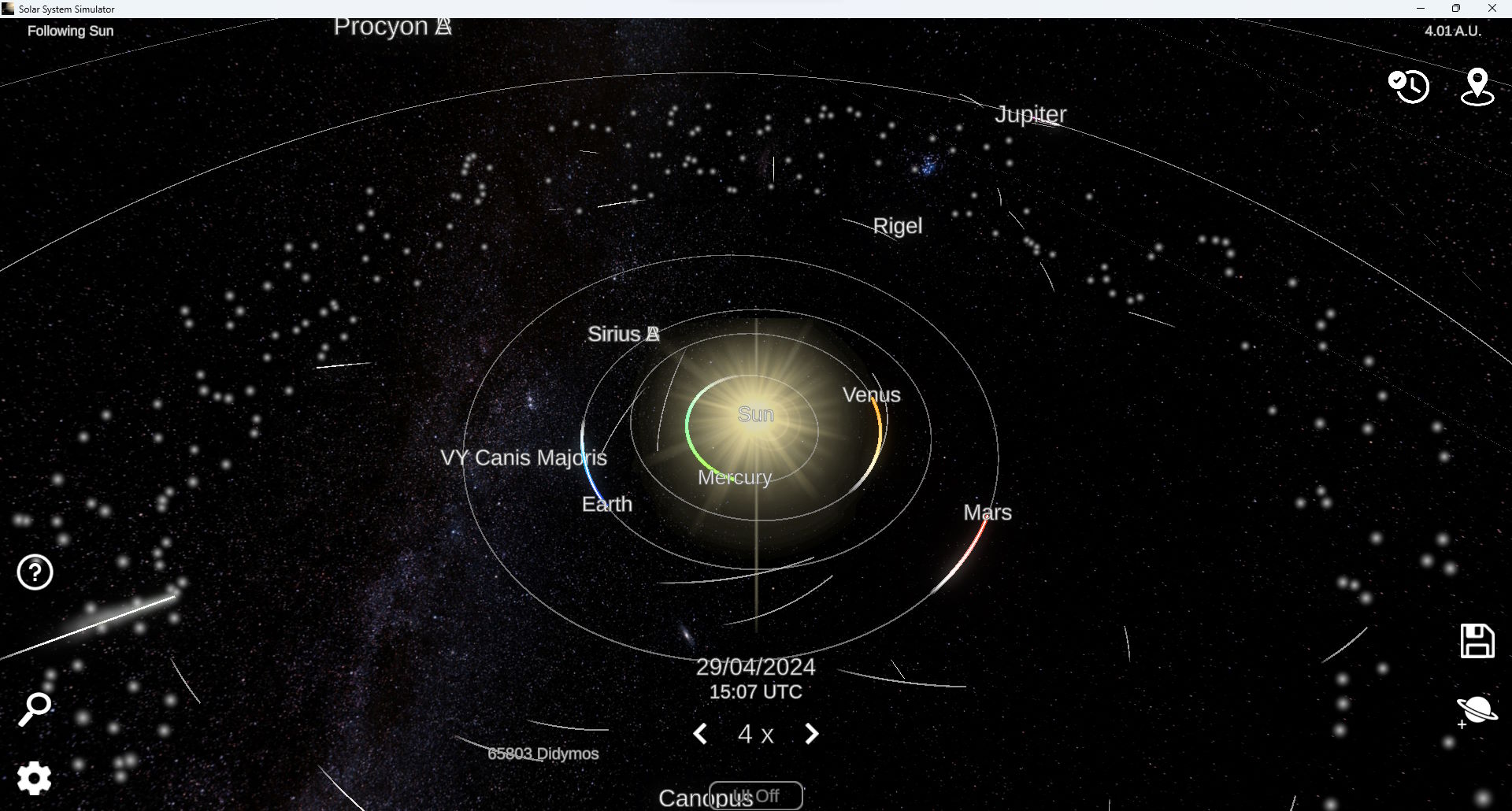
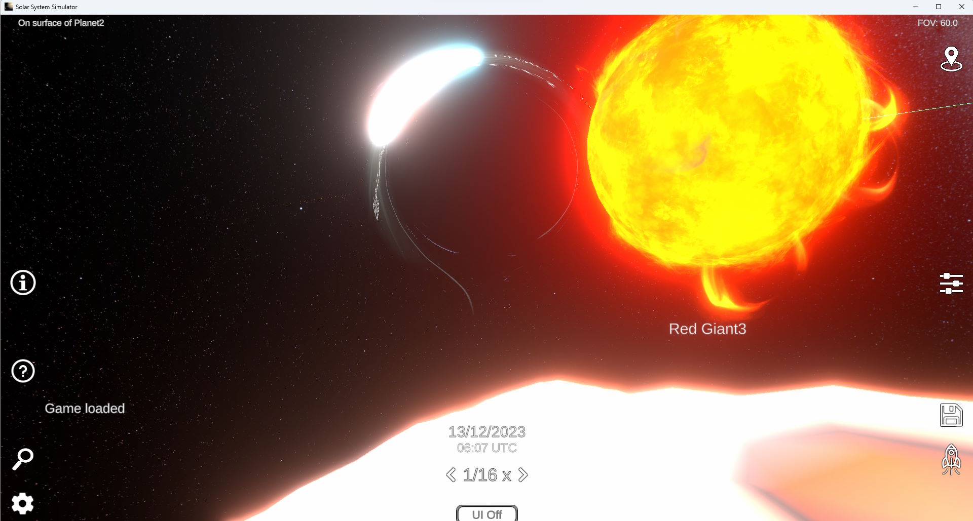
Solar System Simulator is stated as being the desktop version of the mobile “game” and perhaps that’s where some of the issues come in. The first big issue is the GUI. In an effort to presumably have a tidy look, the controls are represented by icons… but the icons are not entirely intuitive. There is a little help icon you can click that will then put labels on the icons… ok that’s a bit more helpful. But then clicking on an option can be a bit of a challenge in itself. Controls just feel really off. A mouse shouldn’t be too different from the past setup of presumably finger control… but it just feels really clunky.
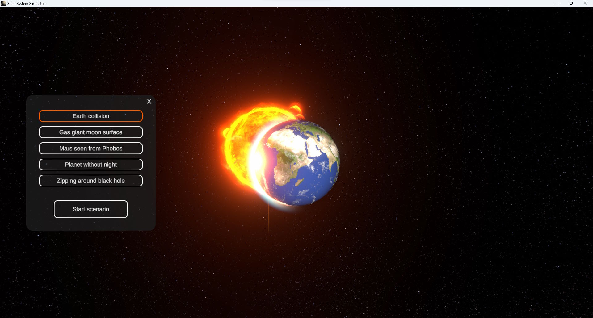
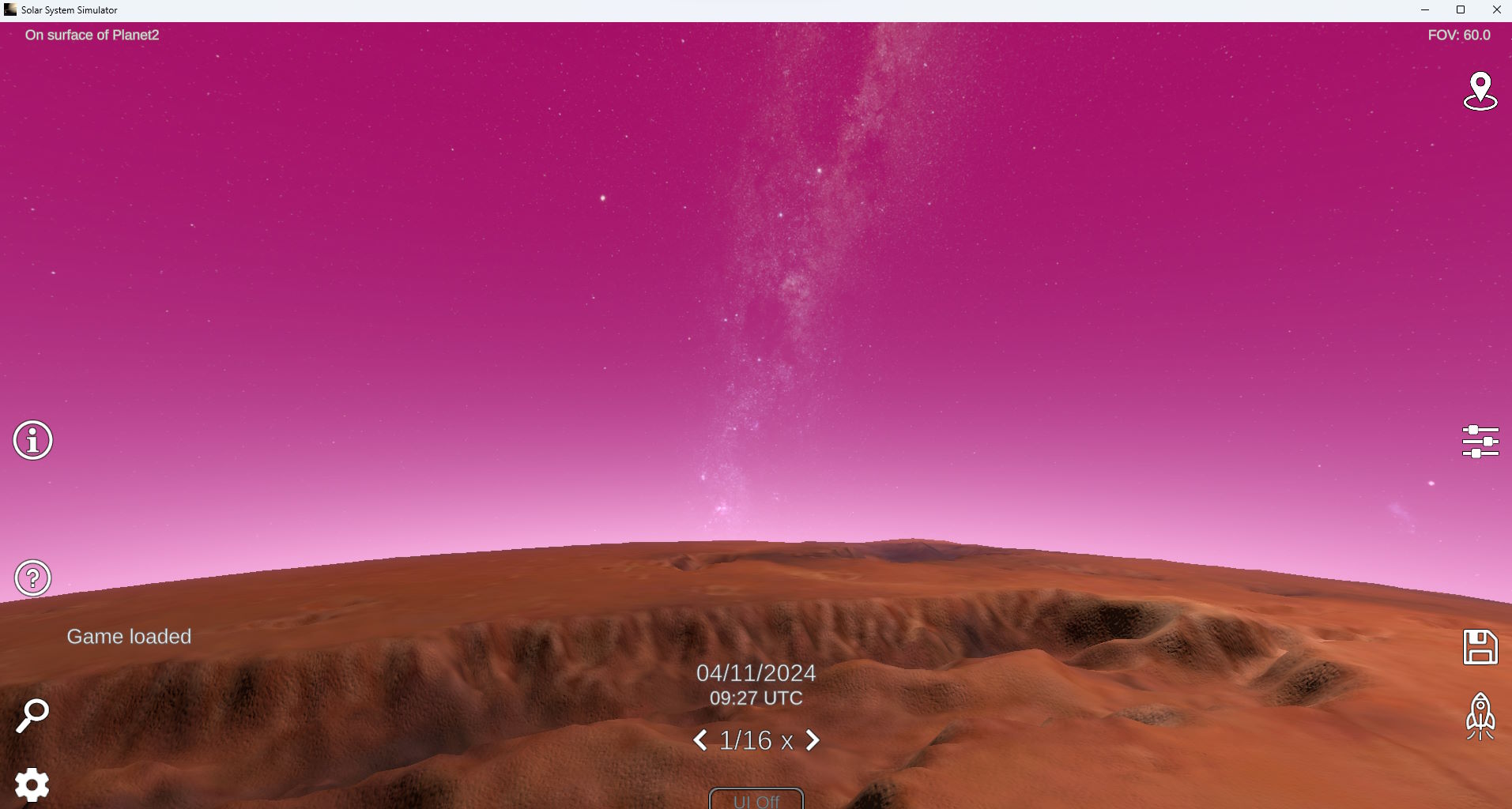
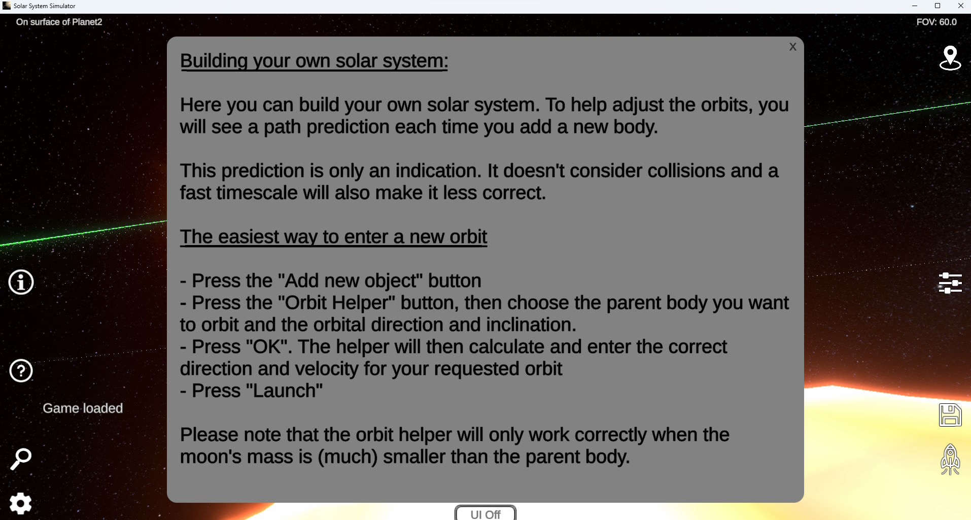
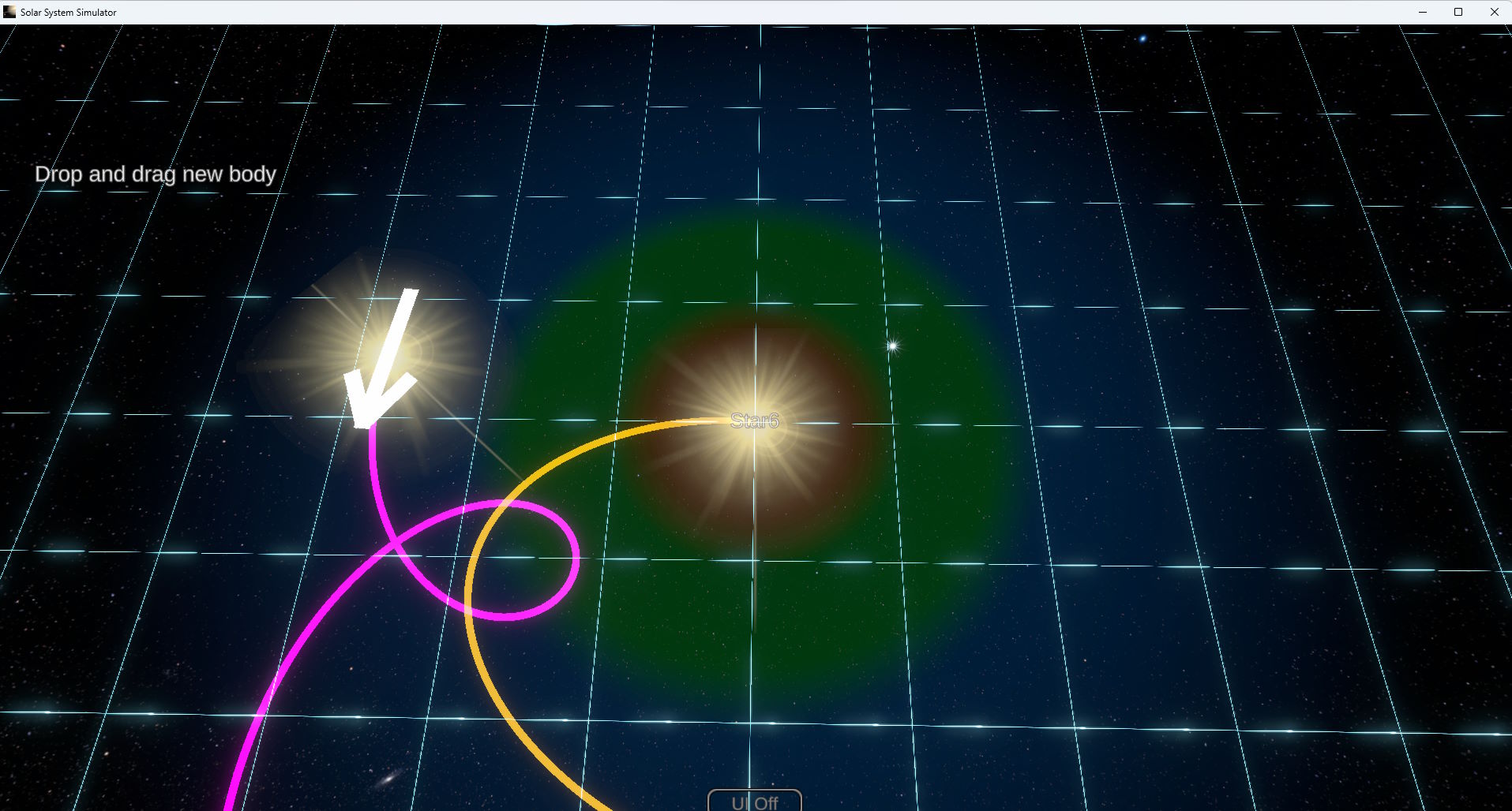
The blurb states that you can explore our own solar system or some nearby stars… and that isn’t too hard to manage with the controls (though still, as mentioned, a bit clunky). Or, it states, you can make your own. I gave this a quick try and whilst putting down the first item seemed easy enough… the second seemed a bit confusing and with very little instruction or useful guidance it was hard to know what exactly was going on or being done. I think the big issue here is either that the mobile version limited the developers ability to add more context (though I don’t imagine why given how capable smart phones are these days)… or the effort to be “sleek and minimalist” has resulted in lack of information and context.
The very minimal icons around the screen also seem to disappear from time to time for no apparent reason when you click… which is frustrating as there is no indication why they disappeared… I’m not familiar enough with the program to know what has disappeared sometimes and I often didn’t even know what I did to make them disappear or even if it was something I did or perhaps something else happened (a timed event?).
I think the big issue is there are other options out there that provide simulations of the solar system and they tend to do it much better and often with much more depth and information. This feels like a concept that has yet to actually be developed to something to be released to the public… more a tech demo someone put together while trying to learn game programing.
Perhaps I am biased as I was somewhat spoiled as soon as I experience Titans of Space in VR… that is a very hard act to follow and whilst that was on rails while this is supposedly sandbox style… when it’s not clear how to really use that sandbox it doesn’t really benefit from that supposed freedom.
Final Thoughts?
Perhaps it will have major improvements in the future and more work will be done with providing context for the controls etc… but as it currently stands I’d say give this a wide orbit to avoid it.


