|
Windows 8
Desktop Review
Welcome to the future of Microsoft
Windows... Windows 8, the biggest revolutionary change to this
family of operating systems since Windows 95. Like Apple,
Microsoft have streamlined their operating system so whether you're
using Windows 8 on a desktop PC, phone or a tablet, it will be extremely
similar on all devices.
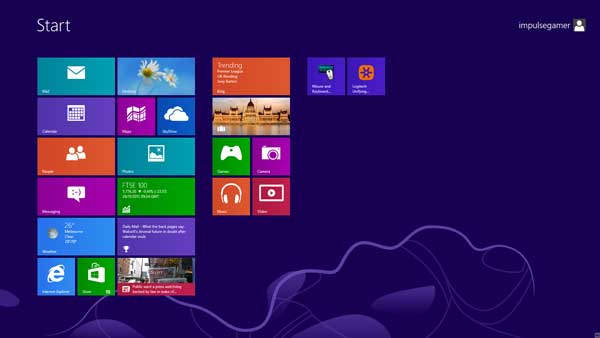
With
that in mind, Impulse Gamer are reviewing Windows 8 on a desktop system
with the traditional mouse/keyboard interface. For the majority of
current desktop users, this will be the primary interface but we also
tested Windows 8 with the new Logitech T650 Touch Pad which in
essence removes the mouse from the equation and allows you to almost use
your desktop/laptop like a touch screen. With that said, Windows 8 on
the new Windows Tablet Surface is very impressive but unfortunately this
is not the case on a desktop machine. It's just a little messy!
We
tested Windows 8 via a download from Microsoft which successfully
installed the operating system on a clean system. Although we had the
BETA version of Windows 8, the installation allowed us to download the
binaries and then format the hard drive for a fresh install. The process
was very fast and there was minimal input from the user. As our test
system was directly connected to our LAN, Windows 8 performed all the
relevant updates and installed the correct drivers for our peripherals.
It was also quite fast as well!
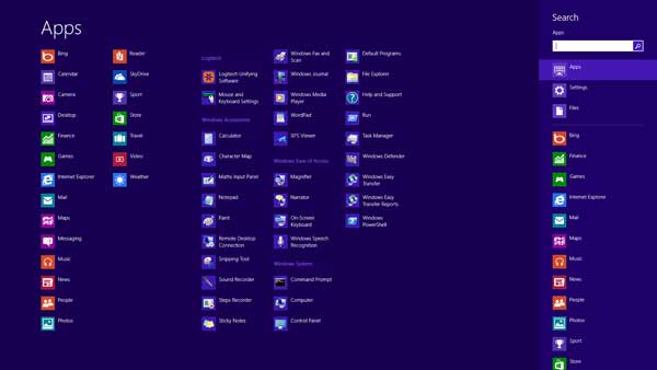
Once installed, we were greeted to a familiar Windows login, however
once we logged on, things became considerably different. Unlike the
traditional Windows interface such as Windows XP and 7, the start button
which allows you to access all your programs has been moved to the Start
Screen. This screen basically lists all your programs without clicking
on the Start Button on your desktop. The new Start Screen will be
familiar to those users who have experience tablets before.
Also,
if you have used the new Windows phone, the Start Screen is basically
the same interface, a series of apps that have been conveniently placed
together via tiles. In relation tiles, you can have tiles such as
widgets that display information in real-time such as weather, stocks
and even updates. Surfing the net, especially with the Logitech T650
Touchpad is almost like surfing the web on a tablet.
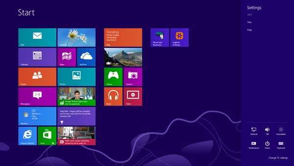
The
charms bar is another new feature of Windows 8 and is accessed by moving
the mouse to the bottom right hand corner of the screen. This
streamlines access to Search, Share, Start, Devices and Settings. Some
apps even install additional information in the charms bar which we
found quite useful. Multitasking once again beats Windows 7 hands down.
Swapping between screens, apps and just using Windows 8 for day to day
things just speeds along.
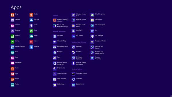
If you
have a considerable amount of apps installed, there is even a search box
to find your programs which is far superior than the Windows 7 search.
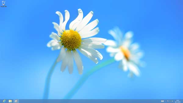
The other big difference is your desktop which is almost identical to
your Windows 7 desktop, however the Start Button/Ribbon is gone. You can
create desktop icons here and this is also your workspace for
applications, games and multimedia. The photos app is very similar to
tablets and makes scrolling through your collection a joy but with a
keyboard/mouse configuration, it does feel a little disjointed.
However when you are using a touch pad such as the Logitech T650,
swapping between the two screens is very smooth and is perfect for
opening apps and my favourite, surfing the net. There are some mice
available that have an element of touch incorporated into them which
assists in the navigation, especially between the Start Screen and the
Desktop. Another workaround is to have two monitors, one to display the
Start Screen and the other, your Desktop.
Interestingly enough, users who cannot succumb to this system will be
pleased to know that there is an app available called "Classic Shell"
which in essence returns Windows 8 to a much more familiar setting. I'm
actually still on the fence on whether the split between the Desktop and
the Start Screen (Start Button) works, even after months of using the
Windows 8 BETA. It's definitely a difficult call as it doesn't feel
quite right.
Even though it may appear that Microsoft have streamlined or dumbed down
the operating system, this is definitely not the case. For example, the
new Task Manager is more ordered and easier to read than the traditional
task manager. I also like how Microsoft have allowed you to look at your
system at a glance, rather than finding information in different tabs.
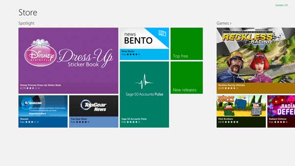
Another feature is the new Windows 8 app store which is reminiscent of
both the Android and Apple stores. It's actually quite a good idea and
definitely simplifies how programs are available to the end-user.
Another standout change is the integration of Cloud into Windows 8.
Using the SkyDrive app allows you to easily store documents and files on
the "cloud" and another great feature is that the new Windows Office
2013 is integrated with SkyDrive, allowing you to automatically save
your files offsite. Sharing between other PC's or even mobile devices
and the Windows Surface tablet has been simplified and is now on par
with the Apple system.
It
should also be noted that Windows 8 boots at almost superhuman speeds.
On our comparable Windows 7 test machine, Windows 8 booted up at 12
seconds. You can even tweak the start of Windows 8 via the task manager
which even highlights the impact a program may be having your on system.
I also love that when you put your system to sleep, it basically does it
automatically and more importantly, when it wakes, it's almost
instantaneously.
Microsoft have also enhanced the file system of Windows 8 such as the
ability of turning on the File History. In essence, this allows you to
save various copies of your documents. Unfortunately it is a little more
complex on Windows 8 as opposed to the new Mac O/S which more graphical
in nature.
Final Thoughts?
To upgrade or not to upgrade. For users familiar with anything between
Windows XP to Windows 7 will definitely need to change the way they
work. It's the biggest change that Microsoft has ever done and in order
to get the most out of it on a desktop system, you would need a monitor
that is touch screen complaint and these are quite expensive at the
present. Not only would this streamline your usage in Windows 8 but it
would make things more productive.
As
they have virtually split the desktop asunder by having a "Start Screen"
and a "Desktop Screen" two distinct entities, it doesn't feel right,
even with a Logitech T650 Touch Pad that definitely assists in the
transition. The operating system is definitely faster and more powerful
but the two separate screens will be an issue for traditional
mouse/keyboard users.
With
that said, upgrading to Windows 8 is definitely a leap of faith and if
you're interested in the upgrade, I would definitely suggest getting a
hands-on test at your local computer store.
Let's
just hope this isn't another Windows Vista but considering the price of
Windows 8... it's very tempting to buy as it's so affordable! What a
conundrum! |