High Moon: Volume 1: Bullet Holes and Bite Marks HC Comic Review
Summary: The Western genre gets turned on it's head... or is that hangs from it's feet?
3.3
Beasts within
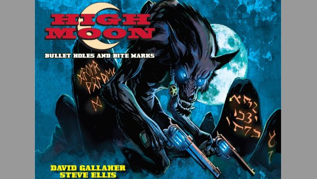
High Moon: Volume 1 Bullets Holes and Bite Marks grabs two big genres Western’s and the Supernatural and mashes them together so hard that things come out a little muddy. The core premise to the start of this tale is that a bounty-hunter by the name of Matthew Macgregor is drawn to the Texas town of Blest to investigate some strange happenings. The town is beset by dust and drought during the day and untold horrors at night and maybe Mr Macgregor is the man to sort this situation out… or is Blest in for a whole lot more trouble?
Writing
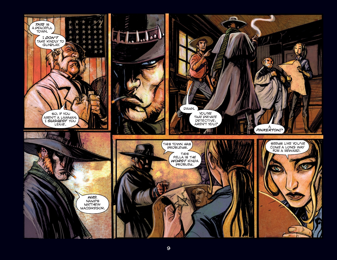
I want to say that I think I know what they were trying to do here… but to be honest at times I can’t even hold to that. The basic idea of the story is pretty cool, a gun slinging Werewolf, that is arguably even better when that Werewolf is having an internal struggle between their man self and beast self. Unfortunately the story gets far too confusing in parts to be able to enjoy. In the midst of dialogue what I assume is a flash back will occur, but that flashback doesn’t always contain much, in fact sometimes it’s just one panel. Exposition is a tricky beast often tackled with “internal” monologue it can sometime either make or break a story. Unfortunately I think the way exposition is handled in High Moon is a bit clunky and can cause the reader a great deal of confusion. I would say that I do suspect that if someone was to read through the entire story and then go back and read it again it probably makes a lot more sense… but on a first read through it just seems quite murky and confusing at times.
Artwork
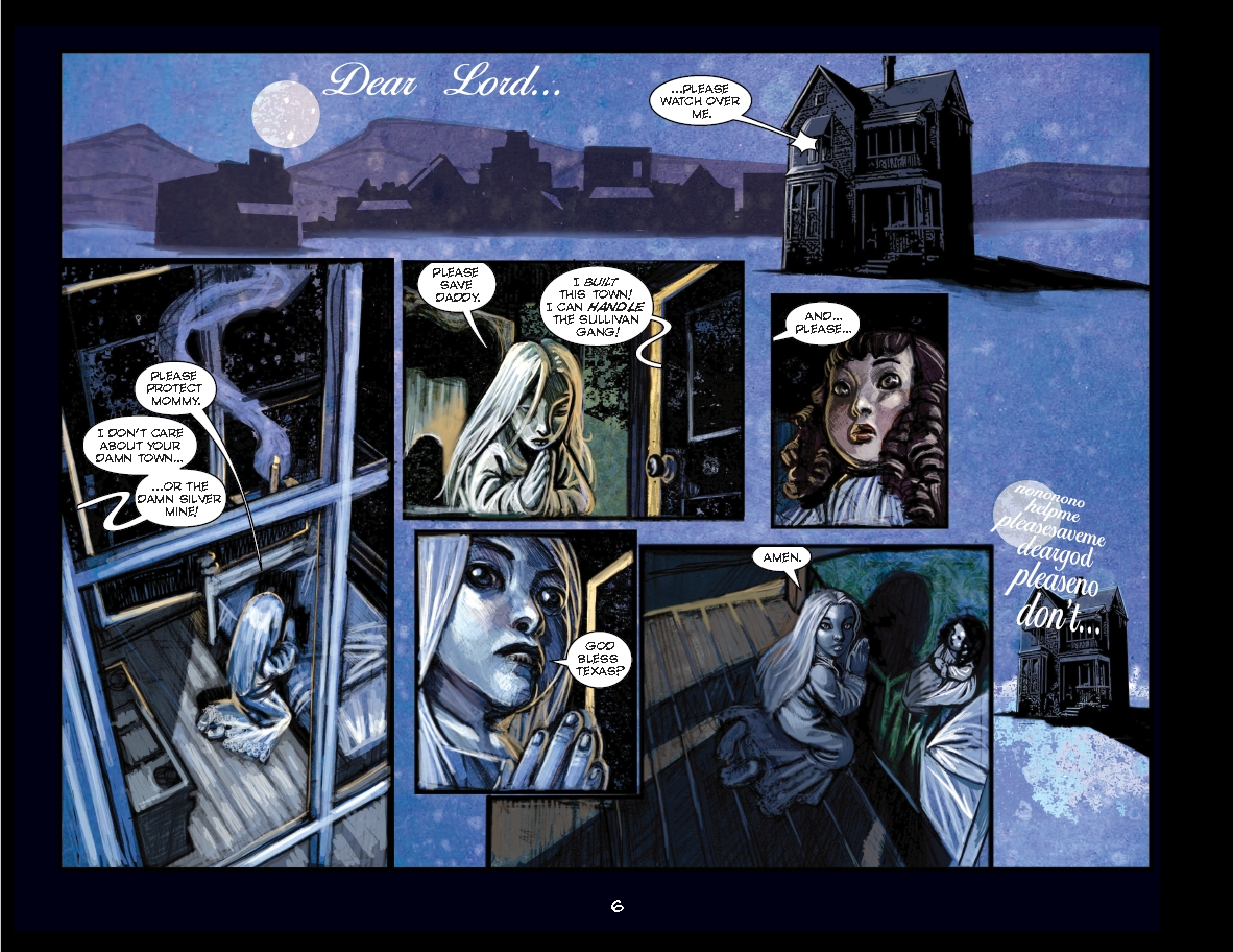
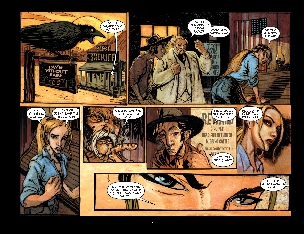
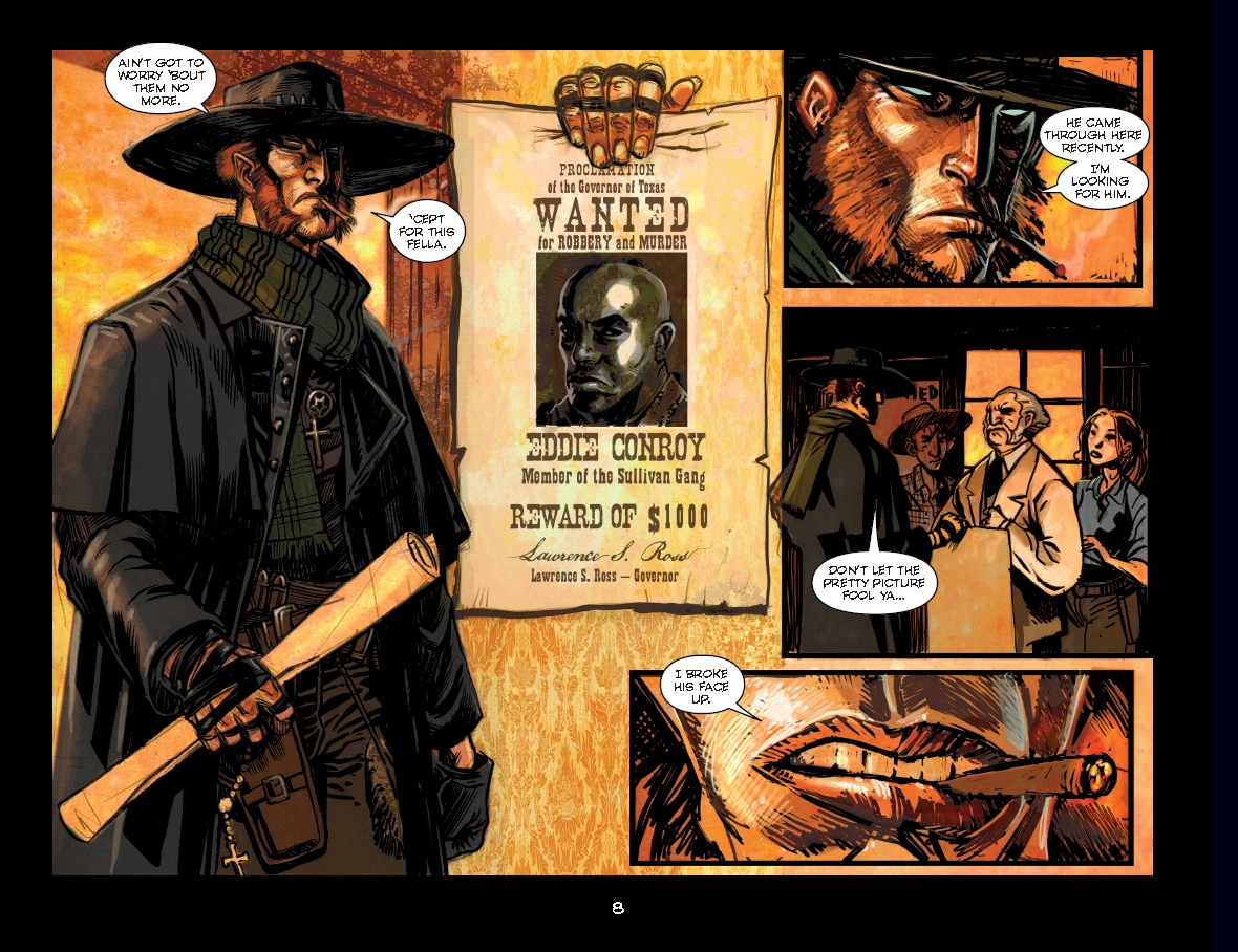
The artwork is also a bit of a mixed bag. On the one hand there are some nice stylised characters, there is quite a good sense of menace in the beasts. But at the same time a lot of the pages are hard to enjoy because everything seems to bleed together. I think the main issue is in the colouring, some scenes are fine with it but others end up just feeling bland and flat because there is essentially one dominant colour and slight variations of that with decent line work the only thing defining characters and landscapes. I suspect that if the colouring was done in a way to help show separation between characters a bit more it would really help liven up the story, instead it’s akin to “oh this is a yellow page… oh this is a blue page… this is a red page”. There is some really lovely artwork there… I just think the colouring has stopped it being able to shine.
Final Thoughts
I feel bad for being so negative about this title… I think what it is trying to do is good… I just think the execution has failed it. I am curious as to what the remaining volumes are like but fear that they will simply follow exactly the same as this edition. Strangely enough I think this might actually be a story that would work better on screen… I think a lot of the issues with exposition and flashbacks would perhaps be easier to cover in cinematic format… or maybe I just don’t “get it”. I’m sure there will be plenty of fans of this series, but personally I’d give it a pass.
Publisher: Super Genius
Writer: David Gallaher
Artist: Steve Ellis
Cover Artist: Steve Ellis
Genre: Western, Horror, Supernatural
Format: 132 pgs, FC, HC
Release Date: 31st Oct, 2017


