My biggest problem with Abyss was not the
lack of prior knowledge I had of the first volume of the comic, but
how I just kept on comparing the books to other entertainment
entities. For instance, take the cover. It says HERO RULE #1:
ALWAYS WATCH WHERE YOU ARE FLYING! From this I got a Zombieland
reference, however this idea of Hero Rules is not followed through
in the comic. But my point is that I spent more time thinking about
other comics and movies, than I did enjoying what was presented in
front of me.

Abyss follows
Eric Hoffman, whose father just happens to be the super-villian,
Abyss. After defeating his father with the help of other
superheroes, Eric is trying to convince the caped crusaders that he
is worthy of joining their ranks. But will they ever be able to
trust the son of the worlds most diabolical villain?
I got an ArchEnemies of Dark Horse tone
from this comic. They have a similar style of humor and some
familiar super hero elements. The humor is probably Abysss
strongest quality. There are some really good lines in the comic,
along with visual jokes.
But again, I found myself comparing Abyss
to other comics. The opening panel has a clock very similar to that
of Watchmen and there is a scene reminiscent of the first
Tobey Maguire Spiderman film in there as well. The character
of Eric also has some Bruce Wayne characteristics. However, the more
I think about, the more I find these coincidences intentional.
Writer Kevin Rubio clearly knows his comics, because Abyss is
not a straightforward superhero tale, but a satire on the genre. He
is able to point out the flaws and cheesiness of such characters. So
perhaps all of these references are just part of his master plan.
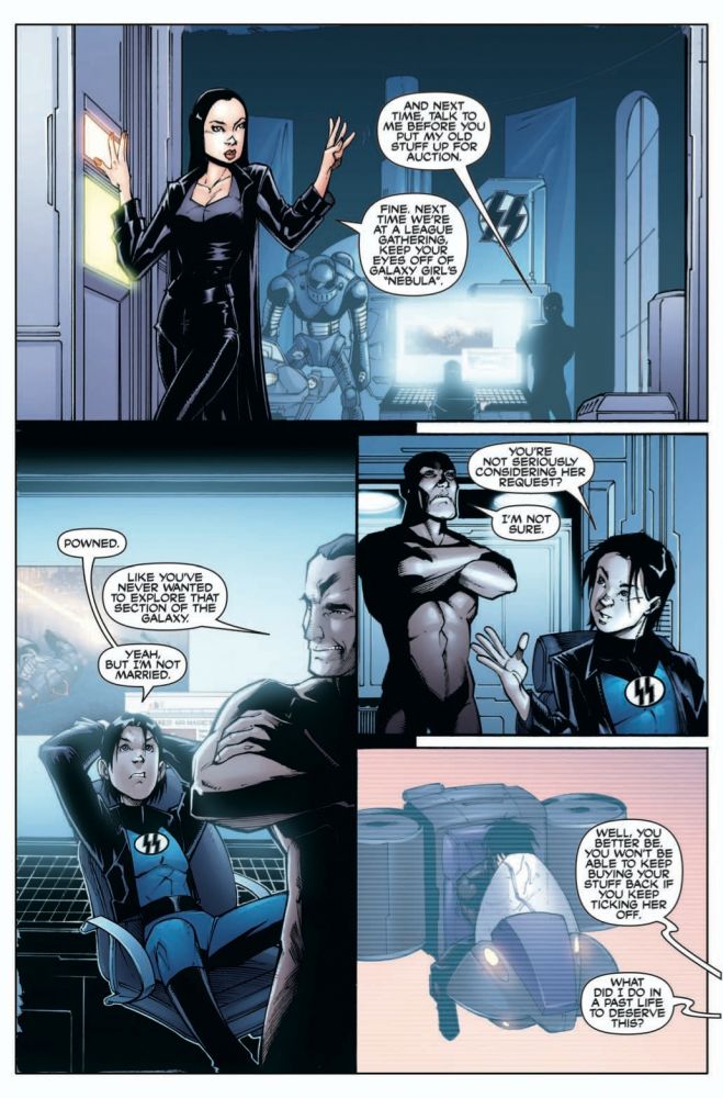
As for Alfonso Ruizs art, I was for the most
part okay with it. But there were two major problems I did find. Mr.
Magic constantly stood with arms across his chest in nearly every
panel, rarely changing his stance. A bit of variety would have been
nice. Also, the characters of Billy and Eric looked so similar that
it took me about a quarter of the way through the book to figure out
they were two different characters. That being said, the mysterious
figure at the end of the comic was drawn and colored in a way Ive
never seen before. I just stared at the panels for minutes trying to
figure out how it was done.
Though the comic for the most part is satirizing
the superhero world, there is one point that they do not make fun of
but embrace. This is in their depiction of woman. Tightly dressed in
revealing costumes, one girl even answers her sorority houses door
in what barely counts as clothes and is just bordering on lingerie.
Sure, all of the women in the comic are strong and powerful, but
they are still objectified.
Plot-wise there is a predictable twist at the end
leading the readers into an unoriginal arc. However, because the
comic is more about humor than serious character development, I
figure unoriginality is not its biggest detriment. What could be is
the publishers attitude. At the beginning of the comic, the reader
gets an overview of what happened in the previous volume. Then,
during an expositional scene there is a footnote that says:
Editors Note-This little piece of exposition is for all you people
who didnt get the first series. Go buy it in trade paperback now!
We can always use the sales! Desperate much? There is another
editors note that made no sense to me as to why it was there, it
just seemed to break the fourth wall for no reason.
What Im saying is, the only thing in the way of
this comic is its indie nature. Of course it wont get the attention
it deserves because it is published by a company that I had never
heard of up until now. But if the publishers keep on getting in the
way of their own comic, I see no one else to blame for poor sales
but themselves.