Bloodhound Review (Xbox Series X/S)
Summary: Bloodhound plays like a rag-bag of bits of other games collaged together in an incongruous mess of ideas and concepts. You might as well play one of the other games that inspired it instead.
1
Why the long face?
When you boot up a game and the literal first thing you see on the title screen is a pair of topless, pixelated angel statues, history suggests that you’re probably not in for a very good ride, especially when they don’t even show up again very much. That’s what you’re unceremoniously greeted by in greenhorn indie company Kruger and Flint’s inaugural game Bloodhound, a boomer-shooter from last year that has escaped containment and found its way onto the Xbox Series X/S this August.
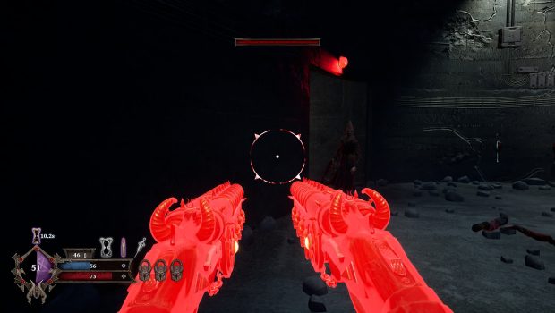
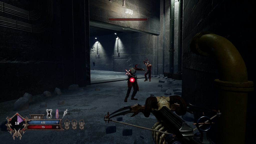
I wish I could say it got better after the cheap shock-value of title screen’s gratuitous pixelated breasts, which, as above implied, don’t show up much in the game proper. The story is relayed in a wordless comic book sequence in which your player character kills a bunch of inconsequential mooks who have found a possessed artefact, then immediately and unceremoniously kills the demon trapped within said artefact and absorbs its powers. Murder naturally follows, to the “tune” of generic buttrock, in what can only be described as basic gameplay. There are some largely nondescript guns, some of them look a little bit demonic and others can be briefly dual-wielded for a few seconds. There’s also some power-ups and abilities that let you, for instance, slow time and pummel your opponents at lightspeed or enter a Painkiller-esque “demon mode” which doesn’t seem to do much besides increasing your damage a bit. If you’ve played literally everything else and are desperate for something to play, one might find some enjoyment in this game’s gunplay, but then again so do other games.
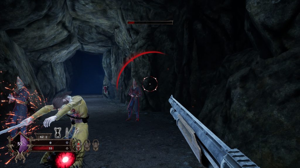
Speaking of other games: looking at the enemies in this game, you may notice that they look more than a little familiar. There are hooded cultists, clearly inspired by the ones from David Szymanski’s Dusk, masked muscly maniacs who bear a resemblance to Borderlands’ Psychos, and “Blade Dancers” who look suspiciously like the Succubus from the much-maligned Agony (a very odd choice in this writer’s opinion, of all the games to ape), even down to being the only other point in the game where pixelated breasts come into play.
This is just one facet of what becomes ultimately my main concern with this game: it feels like a bunch of random ideas borrowed from other games and haphazardly thrown together, like a mystery stew made with whatever incongruous ingredients you find in your cupboards at the end of the month. I could write a list of the things this game reminds me of; the shooting and level design is not unlike DOOM (2016), the aforementioned Demon Mode is very clearly Painkiller-inspired, one of the power-ups is literally just called Super Hot, and the game’s general aesthetic roughness reminds me of a PlayWay S.A game, except with absolutely none of those games’ scrappy charm.
As such, the game feels like it doesn’t really know what it wants to be. At times it feels like TimeSplitters or other such games from the early 00s, sometimes it feels like it wants to be a DOOM (2016) clone a la fellow indie shooter Scathe, and other times it feels like it’s trying to ape Painkiller. It’s a bizarre hodgepodge of ideas that evokes the image of an edgy game concept doodled by a 9-year-old child on the back of a Maths sheet starring all their favourite copyrighted characters.
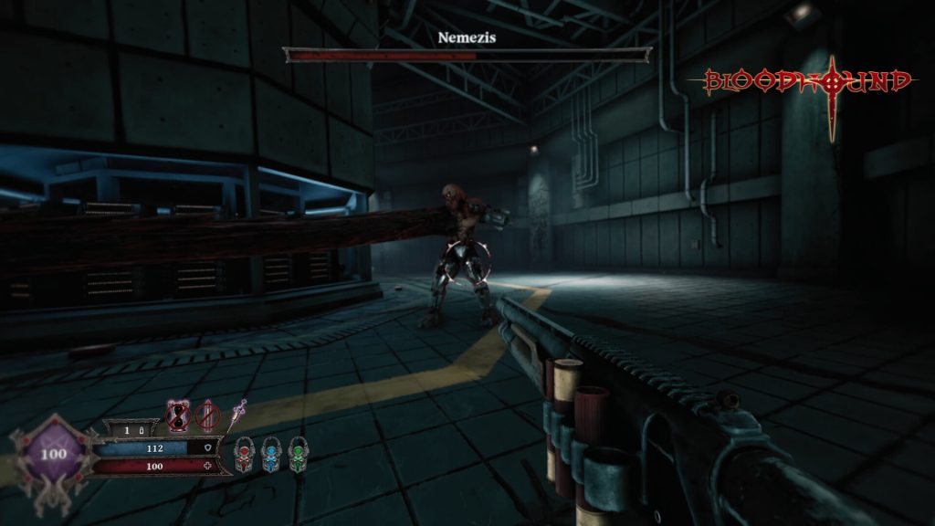
The level design continues the game’s apparent theme of incoherence. Much like the rest of the game’s design choices, the game’s area design is generic, bewildering and purposeless. There’s a cave level. There’s a mountain level. There’s a bunker level. They serve absolutely no purpose being those things besides being a backdrop, you might as well have all the fighting occur on a soundstage. Sometimes it isn’t even clear which way is forward; on more than one occasion I ended up backtracking completely by accident, encountering some odd bugs in the process as the game doesn’t have a precedent for you doing so.
It also does that thing that boomer-shooters do where you’re occasionally locked into an area and have to fight a wave or two of enemies before you can move on – which is fine as a mechanic, but not when you finish one segment, proceed down a corridor and are immediately locked into another wave, consisting of only four enemies. It reeks of low effort. Not to mention, some of them have a length problem – the first level has so many segments that it feels padded, but the second level is over in about a minute and barely anything happens in it. I don’t know how they’ve done it, but Kruger and Flint have somehow managed to make levels that are simultaneously linear and easy to get lost in, as well as levels being too long and too short in the same game.
And on the topic of low effort… this game commits the cardinal sin of having achievements for everything you do. In my time with it, I racked up no less than thirty different achievements, for such Herculean(!) feats as: killing a single enemy, killing a single enemy with a new gun, killing a different single enemy, killing a single enemy with a different gun, rinse and repeat for every unique enemy type and gun in the game, and then again each for 10 kills, then 25 kills, et cetera et cetera, et cetera. When the achievements are so numerous and inconsequential, they lose all meaning, and this is in full effect here. It was to the point that it genuinely got a bit irritating hearing Xbox’s little “powonk!” whenever I got another new achievement.
Oh, and the porting work to the Xbox isn’t very good either. It runs OK most of the time but the framerate sometimes dips below 60 in more crowded situations, which given that this game isn’t exactly picturesque shouldn’t really be happening. That and the game was clearly not designed for controllers, and it shows in the stiff, clunky camera movement and poor aim assist.
Final Thoughts
To quote Tom Lehrer’s song Lobachevsky: “I am never forget the day my first book is published./Every chapter I stole from somewhere else./Index I copy from old Vladivostok telephone directory.” And so it is as well with Bloodhound. Every single element of this game feels painfully derivative, like it was cribbed from another, better game, and thrown together with no semblance of rhyme or reason. It’s to the point that the only consistent element of this game is its inconsistency. More to the point, it means that you have no reason actually to play it, since it doesn’t even improve or innovate on the elements it cribs. Don’t be lured in by the deceptively low £8.79 price tag, this game is not worth your time or money when you can get, say, the new Doom + Doom II remasters, or Doom 3, for 80p cheaper even at full price.


