Moto GP 20: PS4 Review
Summary: A hit or miss racing sim. Great at what it needs to be, but takes a few hits in some areas. Deal breakers for some but not others.
3.8
High Octane!
Moto GP celebrates a strong return to form with it’s 2020 release. It not an easy ride however and will catch new and casual racers off guard if they are unfamiliar with the racing format. Jumping into the 2020 iteration as my first outing in a MotoGP title, I was immediately confused at the layout. You’re tasked with first selecting a racing class, I chose Moto3 so that I get the full experience.
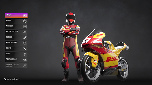
After selecting my class, you’re then given a bunch of profiles to choose from, with no explanation at all. So of course you choose the best and most costly. Although you wouldn’t know it at first, as nothing is explained at all. Then you’re given a bunch of teams to pick, they all have marginally different terms, conditions, salaries and expectations. Finally, you’re now able to customise your rider and this is where the game finally begins to shine. From face, to helmet, gloves, knee pads, number, rider sticker, even your riders driving style. Does he lean real low? Or is he a balanced rider? You decide.
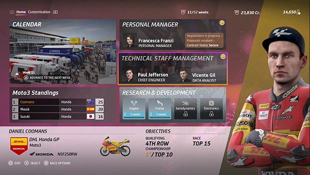
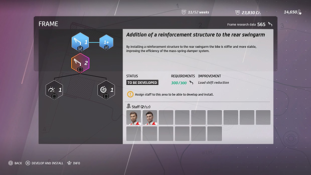
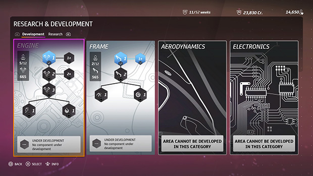
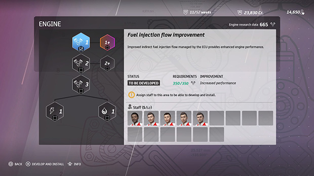
Then a cool little clip plays where team unveils you alongside their other riders. From here you reach the main dashboard, this is where you find out the person you selected after selecting your class is your personal manager. You can now view the race calendar, view staff and eventually hire more and start research and development. It’s pretty self explanatory in it’s own way but at first, new players may not quite grasp what to do with it. Every piece of technology requires staff to research it, the more staff the fast it goes. Each member of staff at first are 50/50 in both engine and frame. As you race more you can hire more staff that have areas of focus.
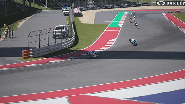
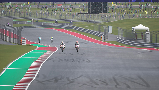
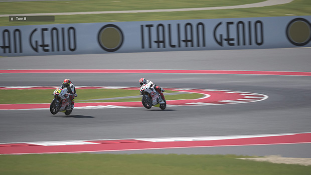
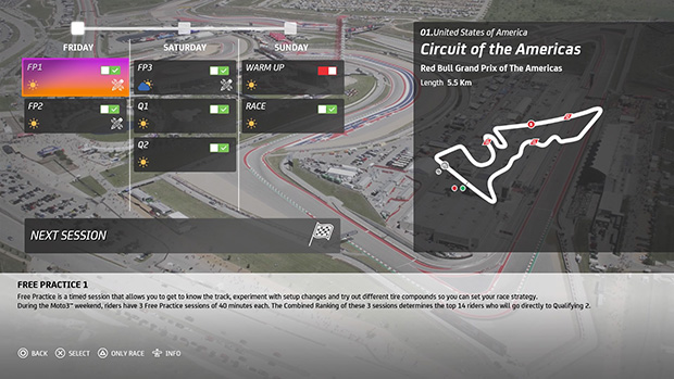
There’s a trick to racing bikes that is very different to racing cars. They handle so very differently, the riding style you choose has an affect on how the bike handles. A stronger focus on accurate handling makes for a challenge. There’s less emphasis on simply holding the stick in a direction to turn, the slightest flick incorrectly can cause you to lose speed or run wide. For me personally it was hard to stick to the racing line in a few key areas at first, but once you get the hang of the handling. Stringing a few successful corners together and maintaining the highest speed is definitely incredibly satisfying. One key example is the snaky section of the Circuit of the Americas, getting that section done right allows for a much better acceleration onto the back straight.
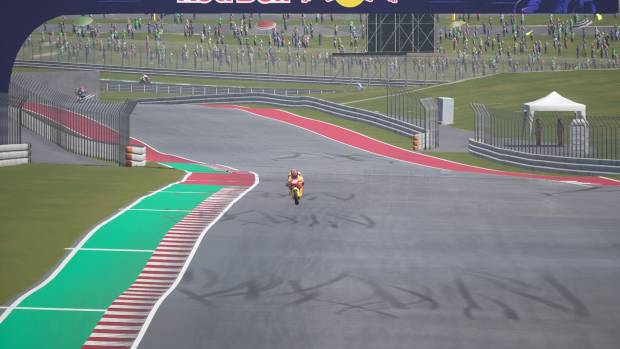
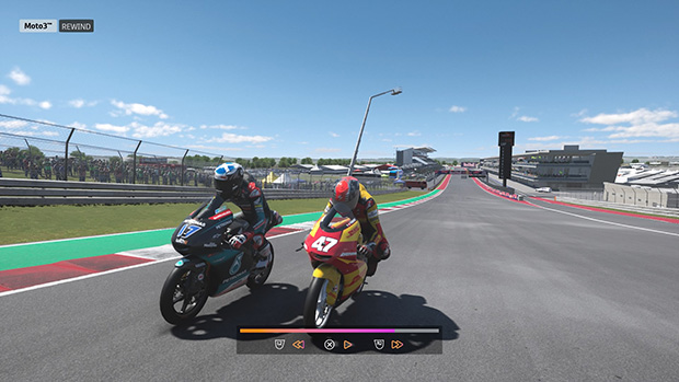
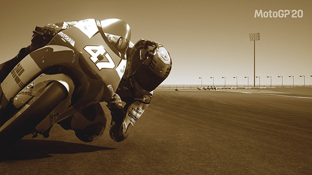
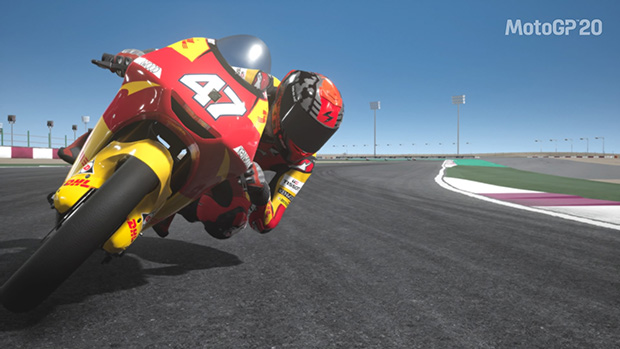
Graphics, well they’re here but not necessarily there. The motorcycles are immaculately detailed, decals are bold, colours are vibrant, everything is meticulous. Riders and their suits too. Photo mode is great too, similar to titles like F1 2019, you can snap some really clear shots, others with motion blur that really captures the high octane action, you even add some cool effects and change the photo entirely. You wouldn’t mistake them for professional shots, but they come pretty close.
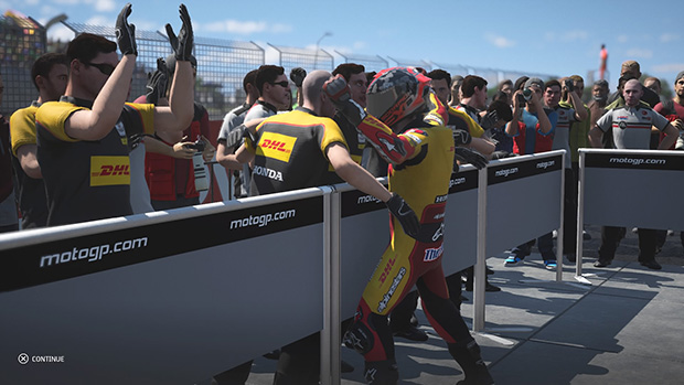
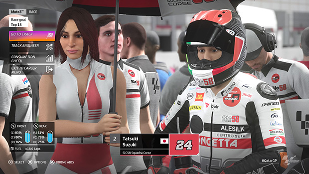
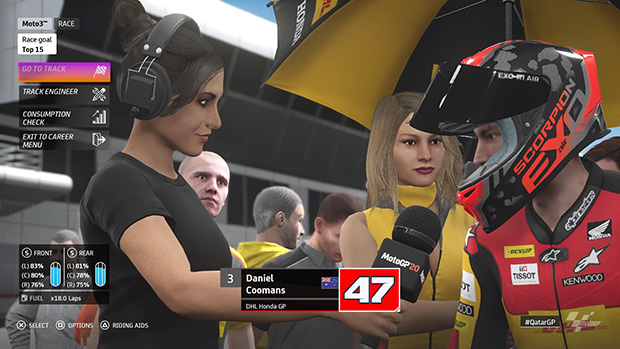
Faces and NPCs however, didn’t quite get the same love and attention. They’re a bit janky at times and far from the realism the game strives to and does achieve in other areas. The tracks themselves while accurately detailed whilst in motion, lack a lot of the character a real race would have. Other racing games go to much greater lengths to ensure the events feel as close to alive as possible in a virtual environment.
The crowds look flatter than they do in other games of the genre and their animation feels really outdated. I don’t know if it’s the norm for real Moto GP races, but I didn’t see a lot of advertisements or sponsor logos adorning many of the tracks. This might have been a design choice or a legal one, however since the bikes are adorned in sponsors, one might assume a lack of consistency they aren’t displayed.
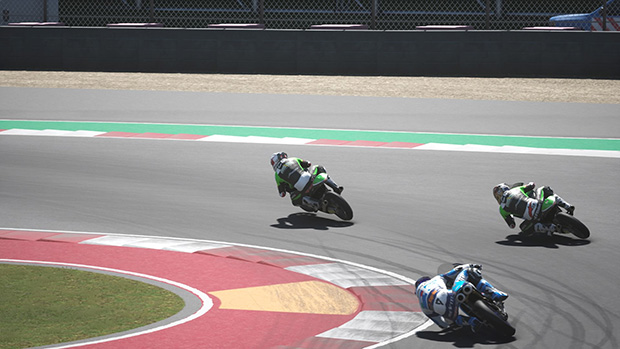
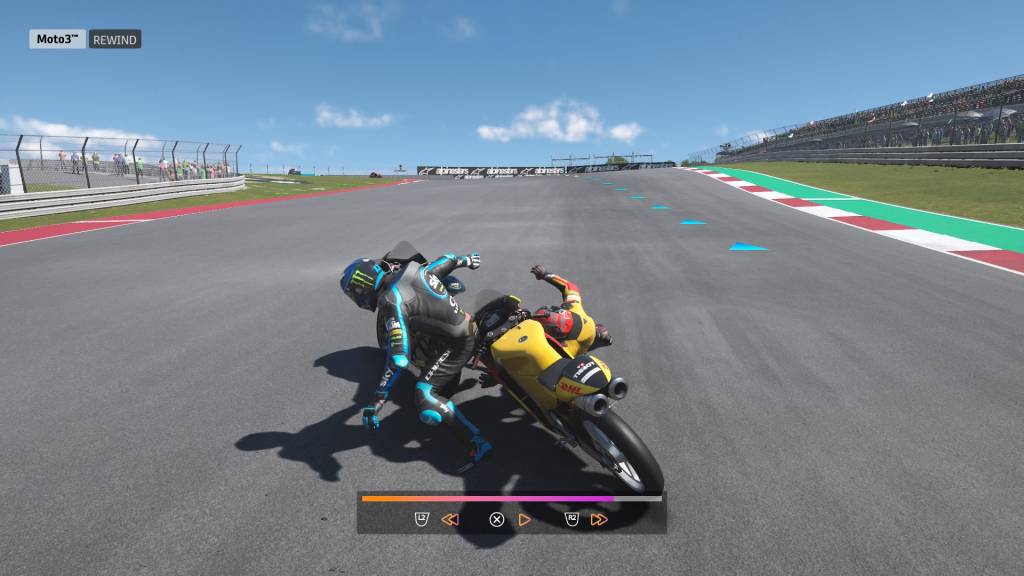
One thing that was great, was the difference in riding style. It’s not just a menu choice, whatever riding style you adapt, your sprite actually adopts. And other drivers too, all have their own riding style. It is visually noticeable, on passes, in replays. I think it was a great addition, as it added a degree of diversity into playing the game. I don’t know if this actually changes the handling of the bikes, as I’m yet to try any other riding style. But even as a cosmetic addition, it’s definitely appreciated.
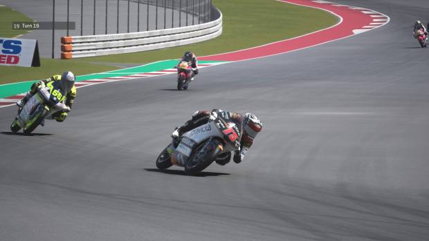
Audio, is another similar story to graphics. Motorcycle audio is great. Clear, booming and grunty. Hearing a bunch of the bikes when they’re grouped up is pretty sweet. And you can definitely hear them when they come up behind you, which is a great audio cue to pick up the pace. As there is no visual cue that they’re behind you and which side you have to come as they try to pass you. The change in pitch and you shift up and down through gears is great too. It really gives you the feeling of riding an actual superbike. Each class of bike has it’s own unique sound too, so the higher class you race, the more different the bikes sound. Compare this to the several different manufacturers in each class and the is a real authenticity to the game.
Commentary is repetitive, but still of high quality. There’s quite the number of lines so it doesn’t happen too often, but naturally with games like these, there’s always going to be a level of repetition. Ambient noise is generally absent from racing sims, the same is true here. There is only engine noise and the screeching of tyres. Music is only featured in menus, garage and after each race session. It’s neither bad, nor good. The music is really only there to fill space that would be otherwise awkwardly silent without it. I’m glad it’s there, but it doesn’t really stand out.
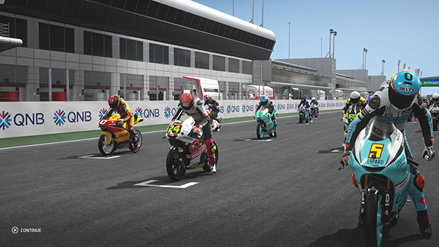
To conclude, Moto GP 20 is great at what it does well. Racing is fast paced, great scalability for difficulty. Easy enough for someone new to racing sims, to get the hang of it after a few practice runs. Excellently detailed bikes and riders, excellent customising ability for helmets. The adoption of riding styles. Good commentary, if a little repetitive. Growth in the aspect of research and developmental parts. All these things are great additions.
However the flaws are equally notable. Lack of life in the tracks and crowds. Poorly designed character art. A confusing calendar system. Not enough fleshing out of the manager system. Lack of information going into the game for new players. No ambient noise and a lackluster musical score.
All of these things combine to create a rather average experience. It does nothing to increase interest into Moto GP, but it also doesn’t diminish from its already established fame. I would like to see improvements on the character art and track design. I feel if those two boxes can be ticked for Moto GP 21, they’ll have a true, solid Moto GP experience.
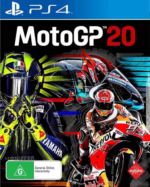
Game Details
Game Genre – Racing, Simulation
Label – Milestone SRL
Rating – General
Year of Release – 2020
Engine– Unreal Engine 4
Platforms – PS4, Xbox One, Nintendo Switch, PC
Mode(s) of Play – Single, Online Co-op


