Fallen Angels #1 Review
Summary: Fallen Angels #1 from Hill and Kudranski falls short of the relatively high mark set by the other Dawn of X books.
2.5
Falls Short
The Story:
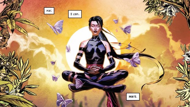
I’m usually a fan of Bryan Hill’s work, but unfortunately, this issue didn’t keep my attention. It starts with an enigmatic “cold open,” which proves to be more confusing than intriguing. There’s too much going on – the reader watches a still unexplained scene of a train hijacking and crash with Hill’s narration simultaneously attempting to reconcile the recent body-splitting of Betsy Braddock and Kwannon (or Psylocke, apparently she kept the name in the divorce), hint at Psylocke’s secret child, and fit in the new Krakoa-bound mutant status quo. This over-stuffing continues throughout the issue and ends up hindering the mysteries presented rather than drawing the reader in.
If there is one particular area in which Hill puts in solid work, it’s the way in which he weaves in metaphors and imagery of war, mercy and transformation throughout the issue. These metaphors create a solid through-line and show off Hill’s strong literary talent.
Another standout which needs to be recognized is Hill’s mastery of Magneto’s dialogue. Magneto’s short scene captures the essence of the character perfectly. Hill is able to efficiently convey Magneto’s menace, sense of honor, and the gray area between good and evil that he’s recently carved out.
The Art:
I’ll be frank, I really did not like the art in this issue. Szymon Kudranski, who is known for his work with “darker” characters like The Punisher and Spawn appears to fit the tone that the story is going for on a surface level, but the constant barrage of blackness is exhausting and uninteresting. I’m not intimately familiar with Kudranski or colorist Frank D’Armata’s other work, so it’s hard to tell which of the artists is to blame for that choice.
Additionally, Kudranski makes a series of strange choices with his panel compositions that gets to be extremely repetitive. A huge portion of the panels in the issue are extreme closeups, focusing on the characters’ eyes or mouth. It can be a strong art choice when used sparingly for dramatic effect, but it really loses all impact when it’s relied upon as often as it is. Psylocke’s back-to-back conversations with Magneto and Mister Sinister are structured almost the exact same way art-wise. It’s as if they were going to choose one of the two villains for her to have a conversation with, asked for thumbnails of each to see which worked better, and ended up leaving both in.
It’s not all bad however, Kudranski shows off a strong ability to render the characters and does some truly beautiful facial work. With a few tweaks in his panel choices, composition, and color, Kudranski’s art could truly shine.
Final Thoughts:
Despite some bright spots in the dialogue, Fallen Angels #1’s plot doesn’t do much to grab the reader and is ultimately fairly forgettable. The art shows some promise, but the issue’s darkness and over-reliance on closeups really hinders the reading experience.
Score: 2.5/5 stars
Credits:
Writer: Bryan Hill
Artist: Szymon Kudranski
Color Artist: Frank D’Armata
Letterer: Joe Sabino
Design: Tom Muller


