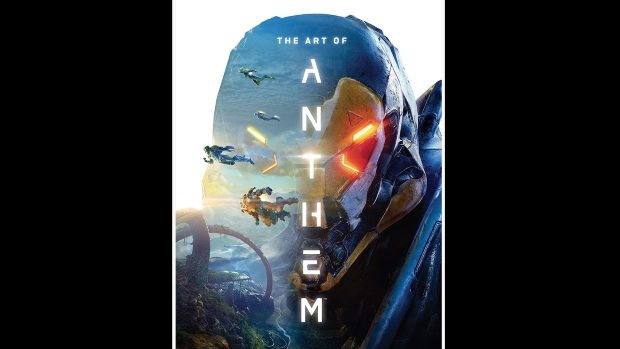
The Art Of Anthem Book Review
Summary: From concept to design to execution... trace the path of Anthem's visual style.
5
Character Building
I have a love of RPG’s, the ability to forge your own character, set their look and backstory. But I always get caught up at the start trying to get just the right fit for my character… making sure their outfit looks right and perhaps most importantly, making sure their name feels right. The Art of Anthem reminds me of that process… stretched out over 192 pages of stunning art work… is the design process that brings the game itself to life… never mind my having to select from a handful of aesthetic options… this book represents the countless variations the designers went through to hone their vision down sufficiently for people like me to then labour hours over to determine my individual player character.
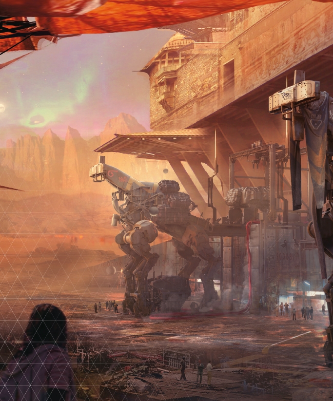
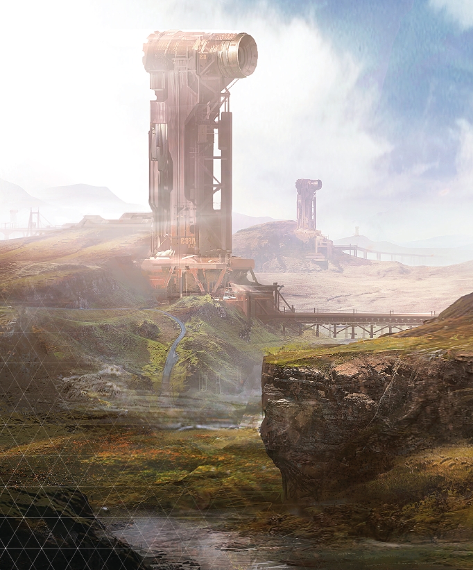
But that’s exactly the point of this book… it shows just how much time and effort went into making the world of Anthem seem believable… it shows the painstaking attention to detail, the sometimes subtle differences between one iteration and the next and how those seemingly small changes make such a big difference to the overall look of the game and subsequently the immersion we feel presented with those visuals.
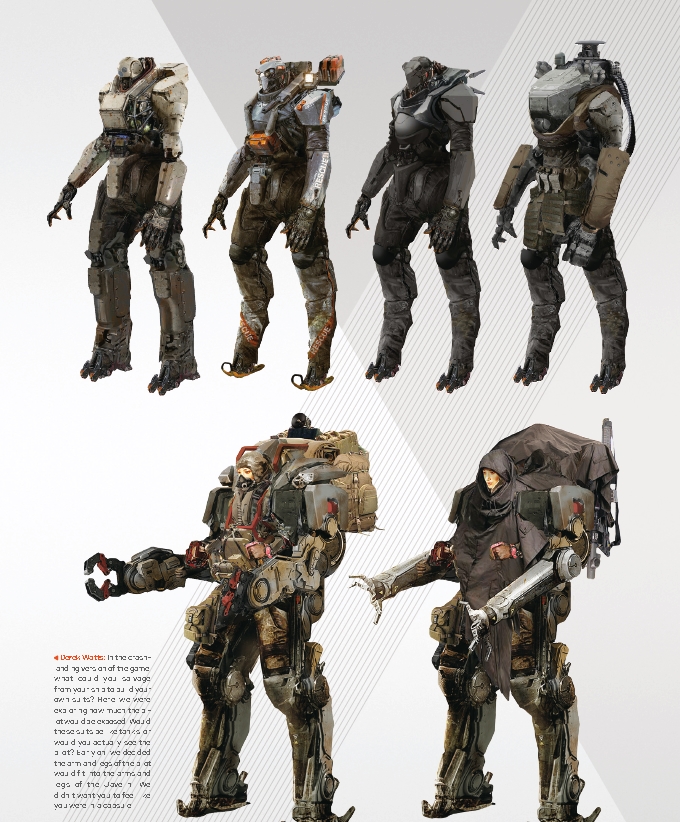
A lot of the book shows character sketches, both of the people and the machines of Anthem. These sketches are quite fascinating in what they can do as visual cues as to the world in which they exist. The design differences between factions, the cultural history of groups written across their skin or clothes. All these little things that come together to paint a larger picture… it’s quite striking just how much we can “read” about a character from the visual clues scattered about their personage.
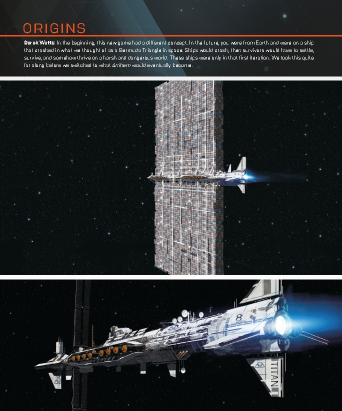
But art departments don’t just determine how the finished game will look by presenting the images that will be used… they determine how it will look by showing what doesn’t work, by showing what might work in a different context but that doesn’t quite fit this interpretation or realisation. Seeing the images that didn’t make the cut can be just as interesting as the ones that did make the grade… they almost represent the alternate universe version of the finished product… the idea of what it might have been instead. But when taken as a whole collective… it becomes clear why some images work and others don’t and it can help you appreciate the version that is released just that little bit more.
Art books always fascinate me, especially when they go into the how and why of the choices. They read very much like a story in their own right. The initial concept is laid out, the first few “rough” sketches are made of what the style could be and then the revisions that are applied as time goes on… it’s a fascinating progression that gives you a greater appreciation for what goes into bringing us a high quality gaming environment. Whatever you think of the game itself… this book is a great example of the work that goes into bringing a game world to life… infusing the environment and the world into the characters and creating a believable living world for the player to exist in.

