Lucifer #2 Review
Summary: A great looking book with a confusing, but engaging storyline.
4
Beautifully rendered
Of Red Death and Ginger Tomcats
The second issue of Lucifer under DC’s Vertigo imprint is a beautifully rendered book. Unlike the Hellblazer series, this book has more of an old-school Vertigo feel. Being the second issue, the story is just getting started, and while there isn’t a lot of lead in as to what happened last issue, the book is engaging enough to draw a more casual reader in.
The Cover
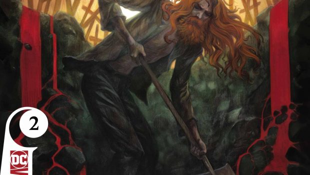
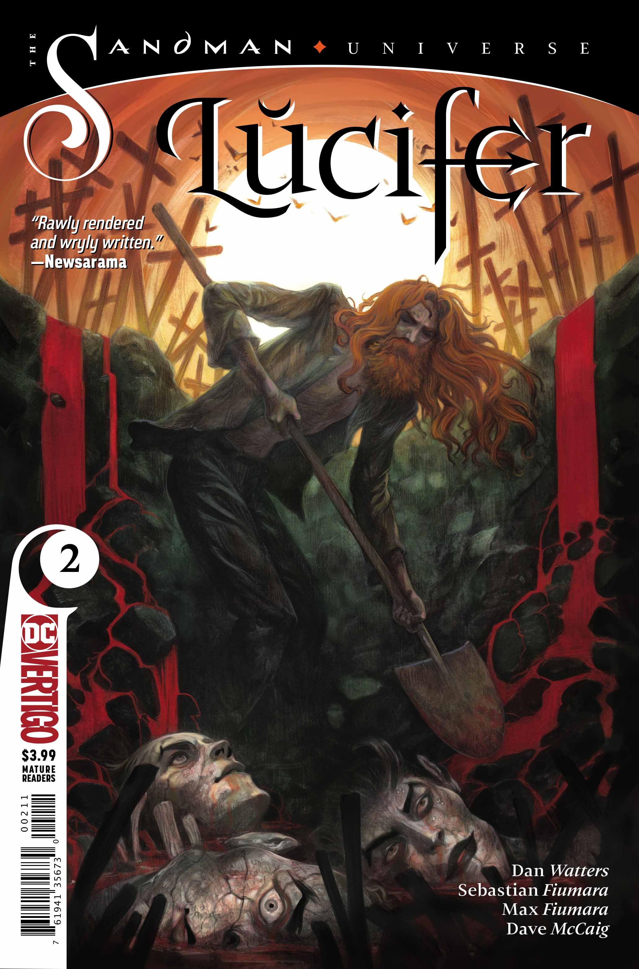
The cover of Lucifer #2 features the titular character bearing a shovel and digging in what feels like a graveyard. We can see that he’s exposed what looks like statues, demonic in nature. The sun appears in the top center of the page, illuminating several crosses visible above ground. Blood is also pouring over the edges and into the hole. Lucifer looks bedraggled. Long, unkempt hair and a long beard, as well as dirty and worn clothing show that Lucifer is not in a good place. Tiffany Turrill does a great job on this cover.
The Art
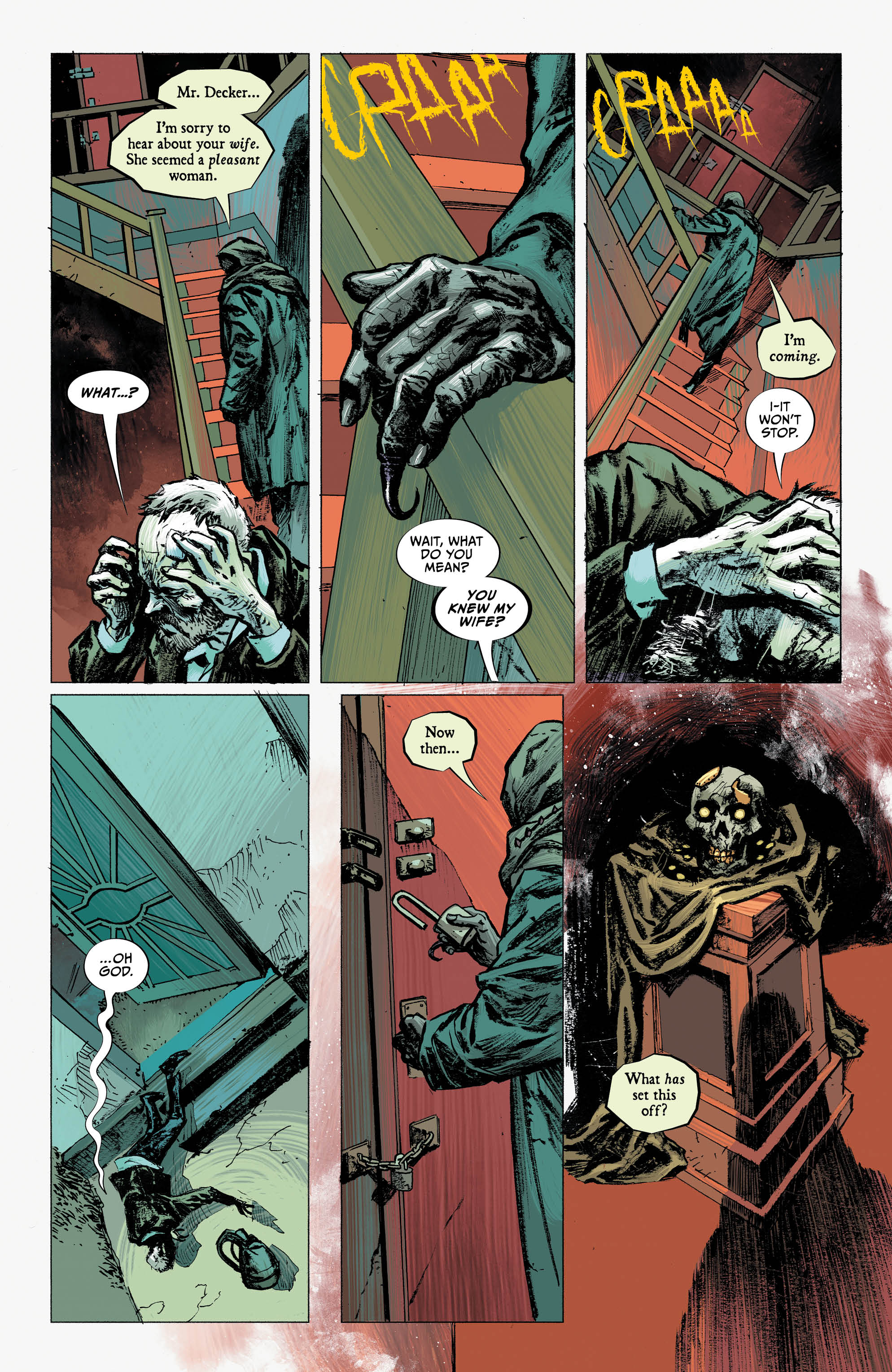
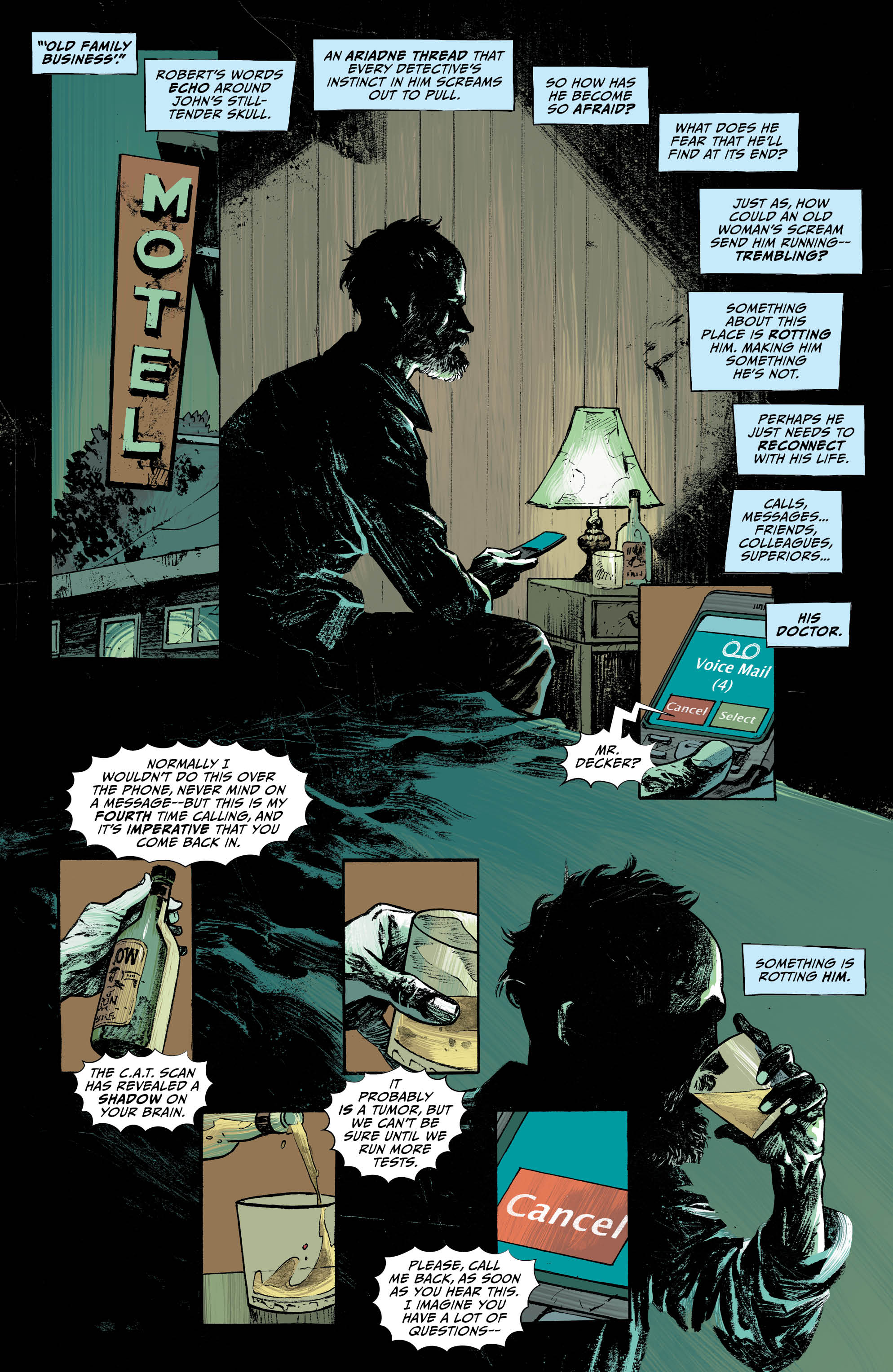
Max Fiumara and Sebastian Fiumara draw a great issue, and Dave McCaig colours the book brilliantly. Lucifer appears at different times charming, demonic, and a combination of lost and broken. The issue does bounce around a bit, and Lucifer’s appearance changes depending on where in his history the story goes. His current appearance is long haired and bearded, almost mangey. In the scenes with the coven he appears his most demonic, with a long sweeping body and horns. Finally, he appears as a clean-cut dandy in his scenes with Robert.
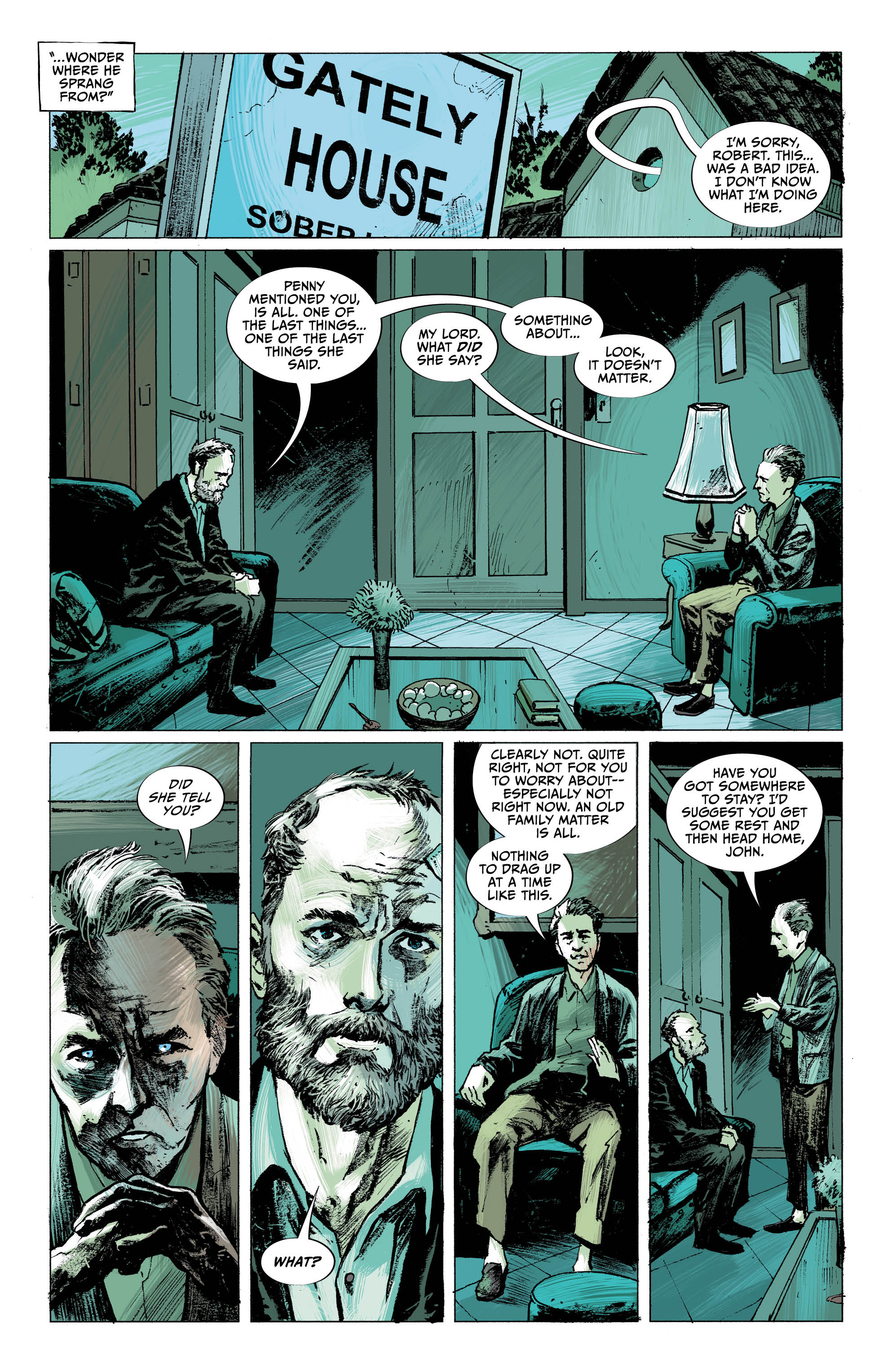
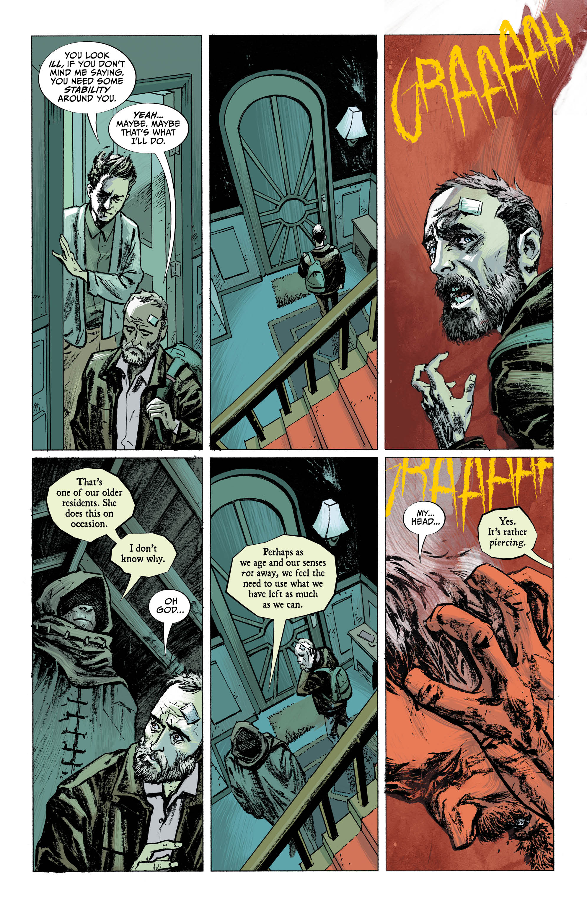
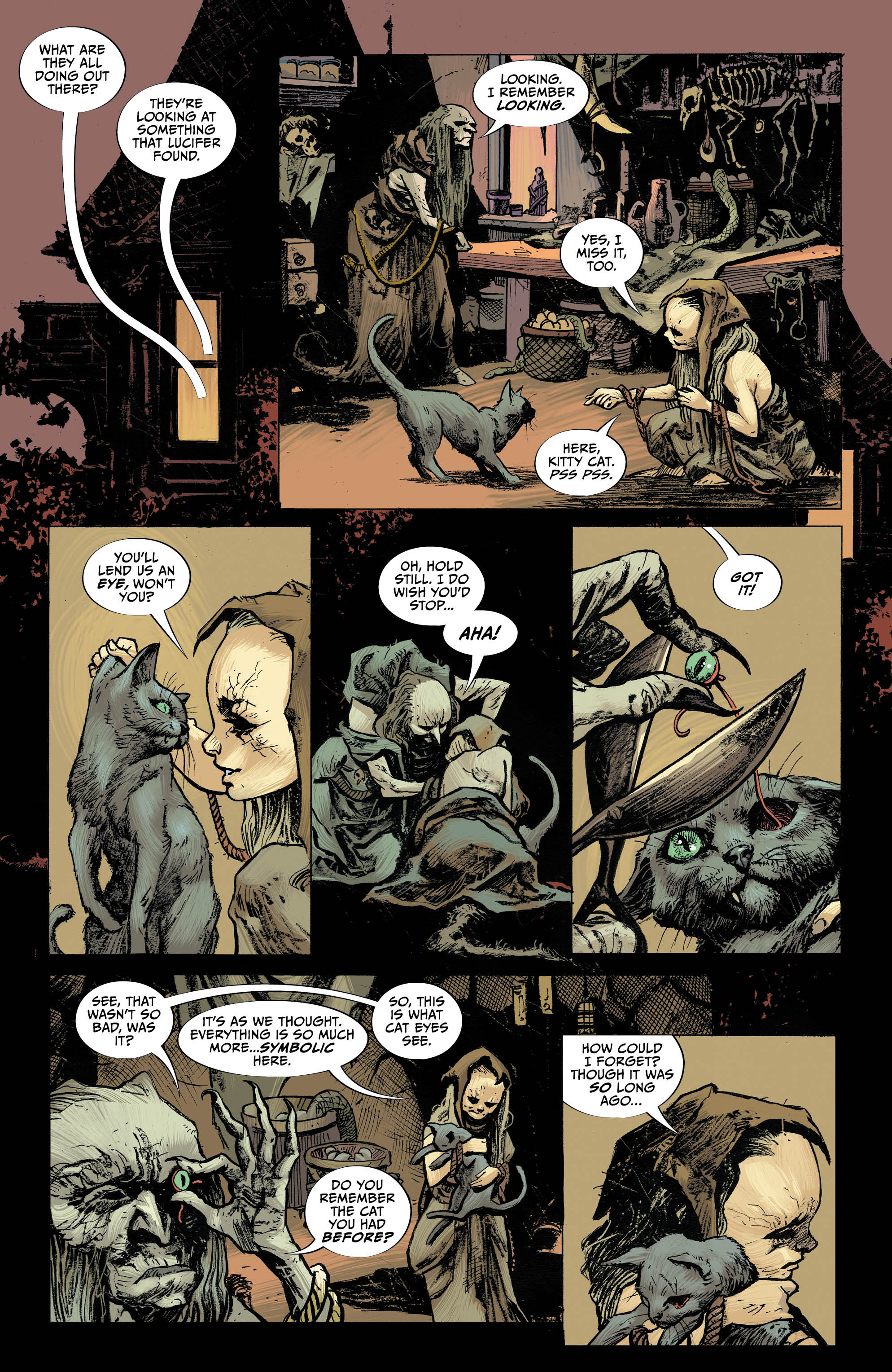
The issue is punctuated by drab colours. Muted blues, greys and whites appear throughout, save for the scenes with the bedraggled version of Lucifer, which are punctuated by oranges and reds. As well, outside of this sort of hellscape, Lucifer himself appears to be a beacon of colour, with bright hair or cloaked in red. This has him stand out from everything else on the page and draws eyes directly to him. By cloaking the bulk of the issue in more muted blues and greys, the uses of orange and red, particularly with Lucifer, subconsciously show the reader where their focus should be.
The Story
Written by Dan Watters, this issue does jump around a fair bit. It splits it’s focus between John Decker, bedraggled Lucifer, and the Witches Coven. While it may seem on the surface that there is a lot to take in and a lot going on, all narrative arcs work well, even if it isn’t apparent how they tie together at this point. The issue begins with the bedraggled version of Lucifer in a sort of hellscape. He appears blind, and is feeling the face of a statue. The image of the individual that trapped him there, in the hopes of finding and destroying his captor and freeing himself.
Next, we are taken to John Decker visiting with Robert, who appears to be a relation of his late wife. He is trying to gain closure, but instead is being dragged into something bigger and darker than he could imagine. Then we have a self-contained story with the coven. It doesn’t appear at this point to tie into anything else, but does make for an interesting narrative, and doesn’t feel like a distraction from the rest of the issue.
Finally, we end with two scenes. One features Lucifer in the hellscape, being attacked by ravens. He clearly has amnesia and doesn’t know who he is or why he’s there. And again, with Robert, as his true visage is introduced to a family member thought long dead.
The Conclusion
Though not a great issue for a new reader to get on board with, Lucifer #2 is still a fairly brisk and engaging read. The inclusion of the witch’s coven narrative, which feels connected to the story but not in any obvious manner, makes it easier to get into. Overall, I enjoyed the various time jumps in the story, even if at times it felt difficult to know where in the narrative each arc was taking place. I suspect future issues will tie this together more cleanly.
Overall this is a great looking book with a confusing, but engaging storyline. 4 out of 5 stars.


