The Joker Daffy Duck #1 Review
Summary: Well written, however, the appearance of Daffy is a little jarring and distracting.
2.5
Interesting concept.
Why Tho Theriouth?
This is one of the DC Comics/Looney Tunes mash ups featuring Daffy Duck and the Joker. This book has a pretty interesting concept, featuring a Daffy Duck that behaves much as he did in the Looney Tunes cartoons, and a Joker that behaves much as he does in the comics. This leads to a slightly off pairing, as Joker is a lot darker than Daffy.
The Cover
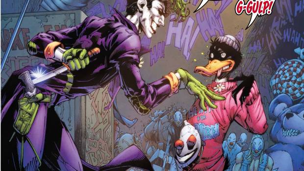
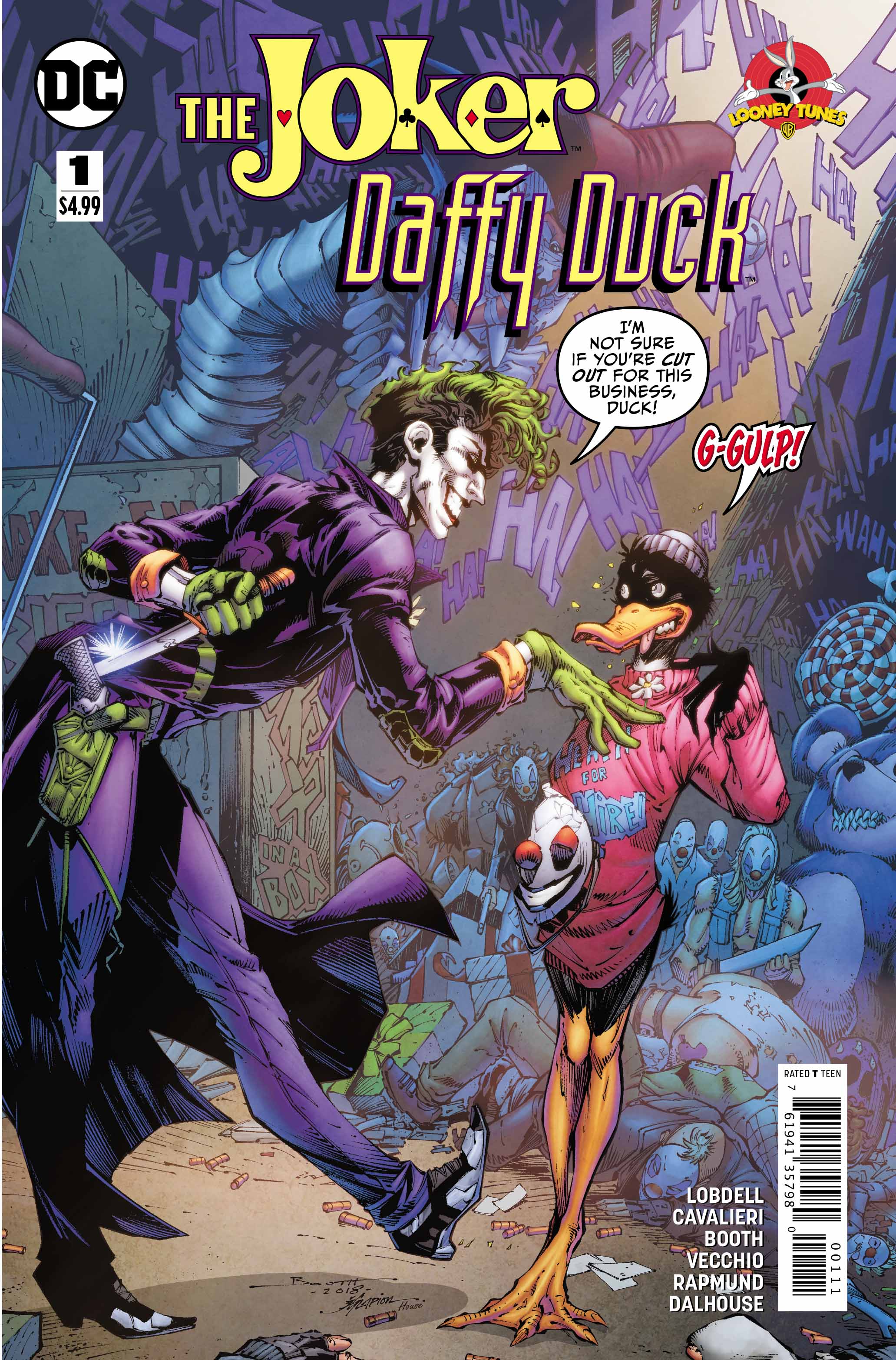
This issue features a standard cover and a variant. Brett Booth, Jonathon Glapion, and Andrew Dalhouse created the standard cover. In it we see Joker and Daffy front and center, with Joker leaning in threateningly and holding a very sharp knife behind his back. Joker looks menacing and feels like he’s been pulled right out of a Batman comic. Daffy looks very intimidated and afraid. H’s biting his tongue and has a very rigid posture. Almost as if he can’t decide whether to run or try to hide. This Daffy also has a more humanoid appearance that I’m not sure how I feel about.
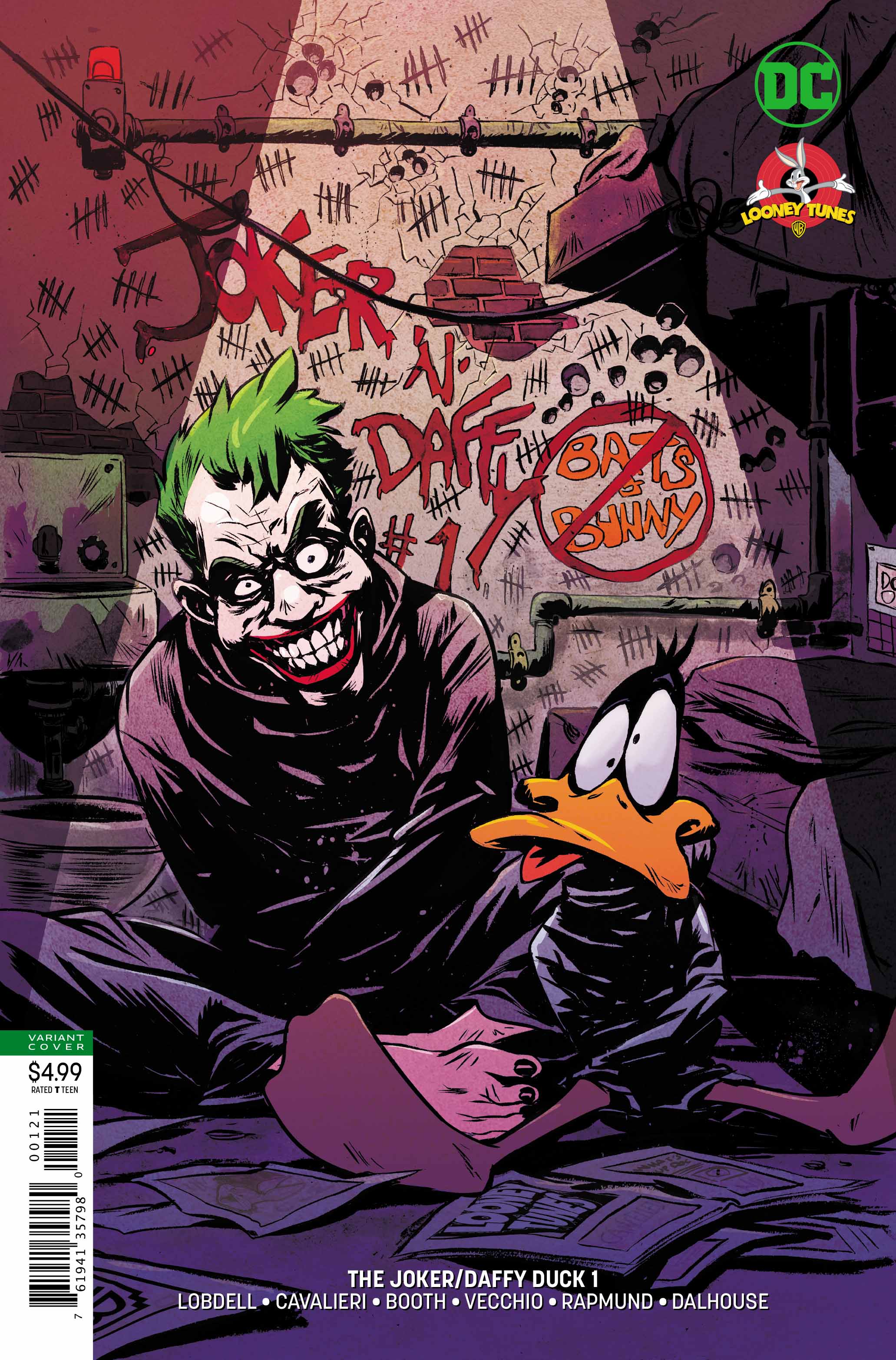
Sanford Greene does the duties on the variant cover which features Joker and Daffy in what appears to be a dark basement somewhere. Each is wrapped up in a straight-jacket, and both looked deranged. Joker looks deranged, and Daffy looks completely befuddled. The Daffy in this issue appears like he’s jumped right out of the cartoons, while the Joker has a slightly more frightening look. Between the two, I enjoy this cover the most, largely due to Daffy’s appearance.
The Art
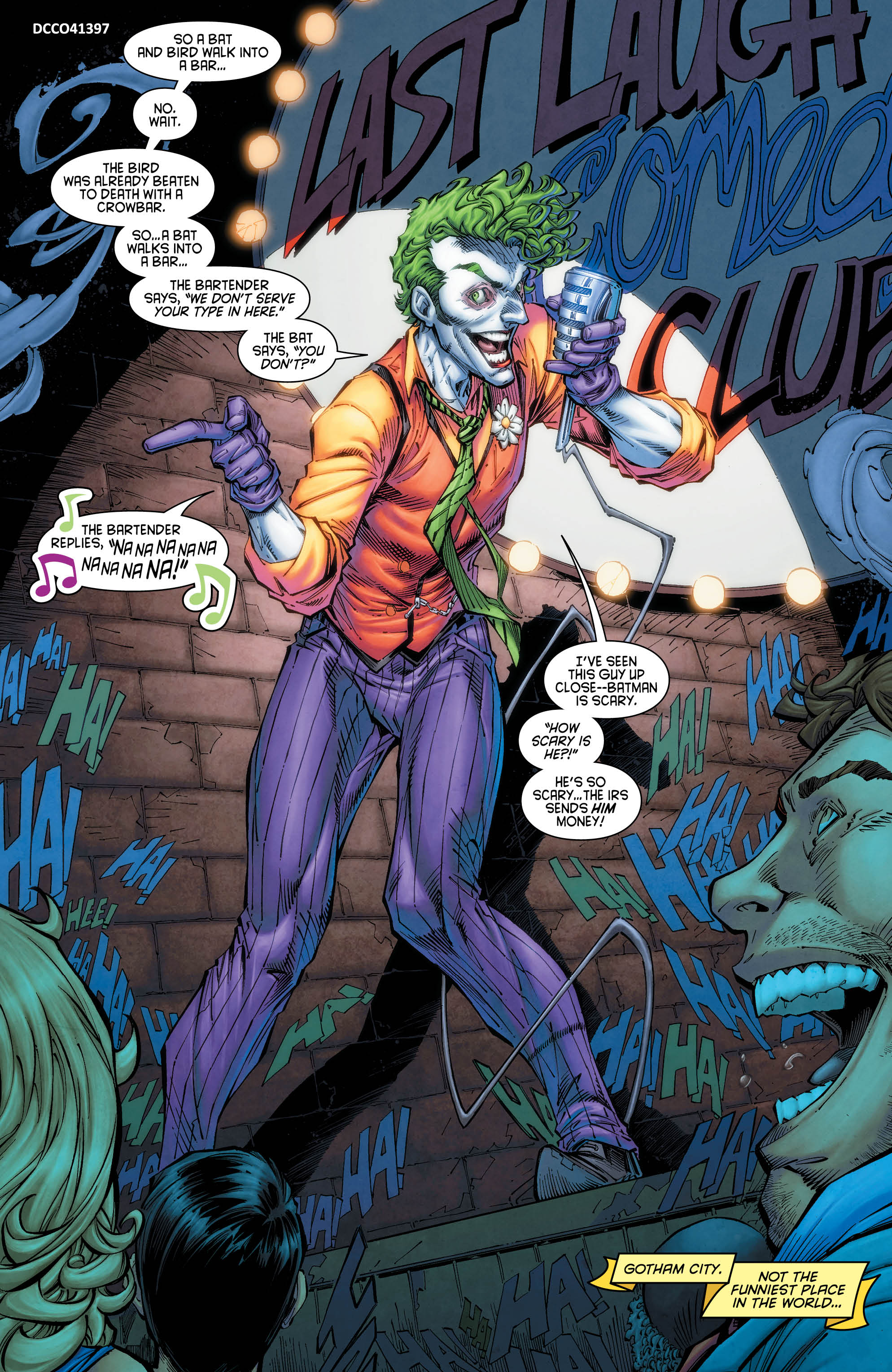
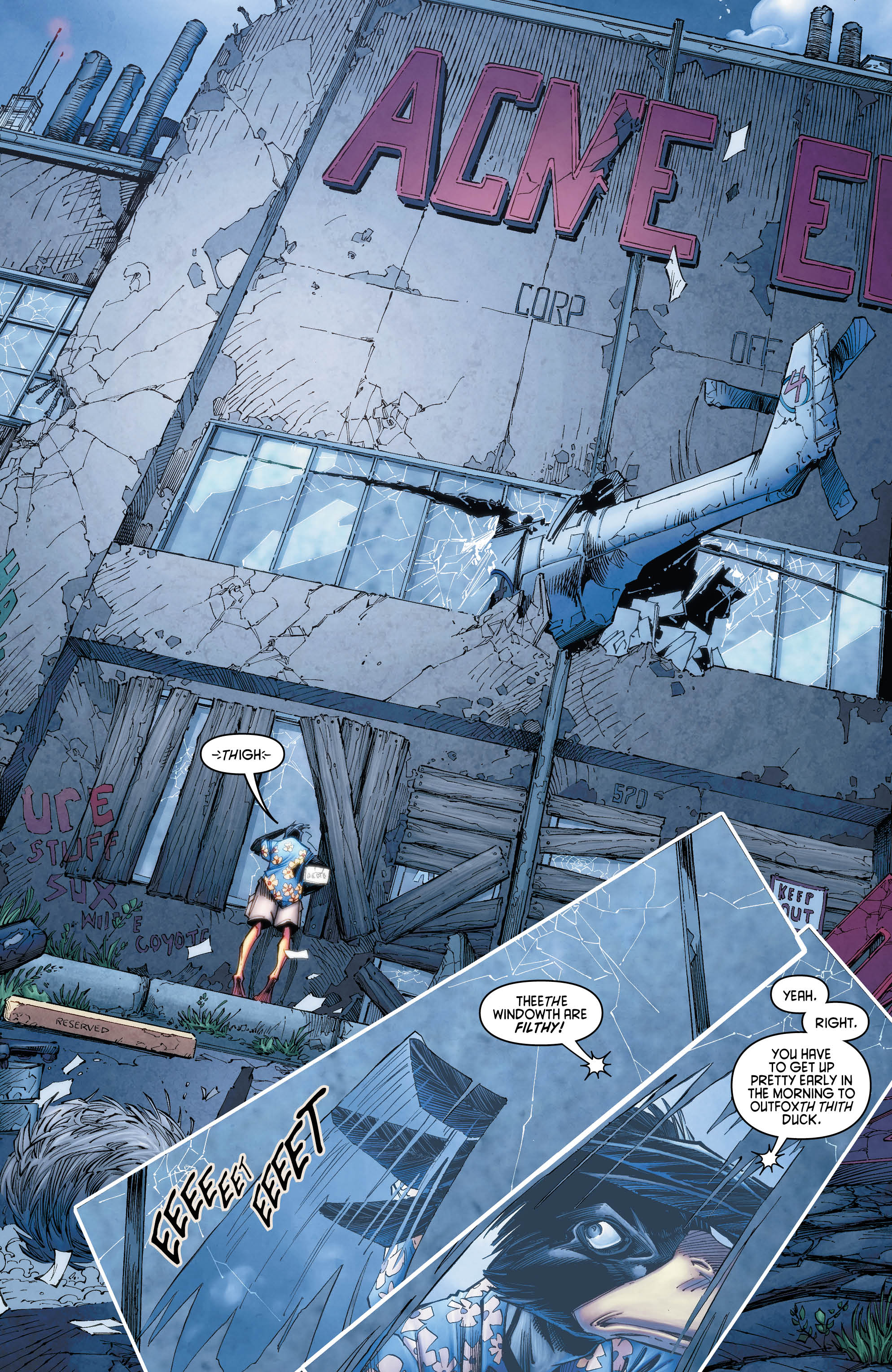
Brett Booth handles the interior art as well for this issue. The book takes place in Gotham, and while feeling dark and a little dreary, it is still brighter than the average Batman comic. The Joker and Batman both look great, in fact, the opening scene of the Joker is one of the better visualizations of the character I’ve seen in a while. Daffy on the other hand feels off. He is drawn as a humanoid duck, and doesn’t resemble the Duck made famous in the Looney Toons cartoons. That said, Booth does a great job making this Duck’s expressions come to life. We can see the conniving, the humour, the anger, and the arrogance of Daffy on full display throughout the book. As for his Joker, Booth does the clown justice.
The Story
This story, written by Scott Lobdell, begins with Joker escaping from Batman after killing his crowd at a comedy club. Daffy is introduced shortly after, and makes his way to Gotham to file a complaint in person with the ACME company. Daffy quickly becomes Joker’s lead henchman, and begins to whip his crew into shape. He even begins to enjoy his role, that is, until he discovers Joker is a homicidal madman. Daffy then sets out to undermine Joker from within his organization. Lobdell does a great job characterizing both Joker and Daffy, playing up the insanity of Joker as well as the sheer ego of Daffy Duck.
The Conclusion
This book is a quick easy read. It is very well written and the story is a lot of fun. I enjoyed the tone set by the art, as well as Joker’s insanity as drawn by Booth. The only thing that didn’t sit quite right was the appearance of Daffy himself. Though well characterized, his look is a little off-putting. I think an appearance closer to how he looks in the cartoons would have added, though may not have fit in with the story overall.
This was a well written book, however the appearance of Daffy is a little jarring and distracting. 2.5 out of 5 stars.


