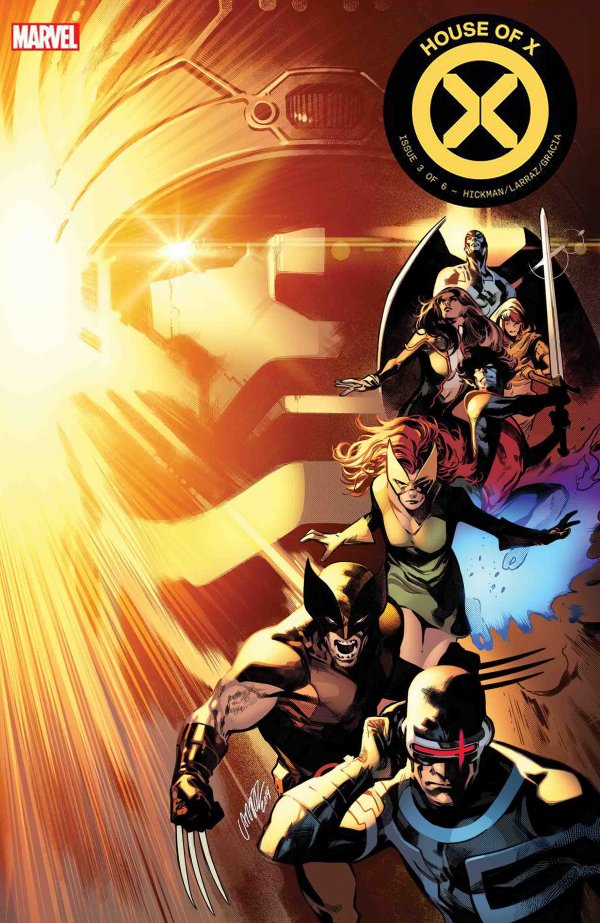
House of X #3 Review
Summary: Hickman maintains the unsettling tone he’s set for the mutants while telling his most traditional X-Men story yet. This amazing, uncanny tale rolls on.
4.5
Amazing, uncanny
The Story:
House of X #3 continues Jonathan Hickman’s reimagining of the X-Men franchise. The weekly series (combined with its sister series – Powers of X) has been an intriguing ride, and this issue is no different. The issue is framed as a familiar and straightforward X-Men story: Professor X gives Cyclops his orders, Cyclops puts together a team and they embark on their mission. However, what Hickman brings to the story is entirely unique. Hickman has presented a masterclass on tone, subtly utilizing it to give the story a wholly unsettling feel.
For example, the opening sequence reads as a faithful, fearful, doubting soldier being comforted by his godlike superiors rather than the standard Professor X-Cyclops briefing session. As Cyclops receives his orders from Professor X (and Magneto, adding to the strangeness), the whole scene feels intentionally off. Cyclops is robotic, almost an imagined ideal version of the character. Xavier and Magneto speak to him with grandiosity, comforting him with the idea that if he dies, he would be immortal, “no one forgets a founder of a nation.” The tone makes the reader uncomfortable, as if they shouldn’t be sure that the X-Men that they’ve known and loved for almost 60 years are the good guys in the story. For the first time in a while, the X-Men feel as if they have a reason to be hated and feared.
Hickman has done an excellent job in playing with the reader’s perspective throughout. The X-Men arrange an attack on the Mother Mold (a device which makes Master Molds which in turn makes more Sentinels). Again, this is a pretty standard X-Men narrative: Mutants vs. human and Sentinels. It is turned on its head and given an almost horror movie feel by Hickman’s tone and choice of perspective. The reader knows contextually that the humans are the “bad guys” in this story, seeing the horrors that Sentinels have wreaked on Mutantkind throughout Marvel history, but one can’t help but feel fear and empathy for them as Nightcrawler BAMF’s his way through the ship or as a human soldier sacrifices himself while his lover listens on. The whole thing leads to an incredibly complex and interesting read.
The Art:
Pepe Larraz is perfect for this book. If Hickman is using his word and perspective choices to create a tone, Larraz’s art is driving it home. In the opening scene I spoke of, Larraz chooses to keep Xavier and Magneto at a distance, giving them an otherworldly feel. Larraz’s Xavier design contributes significantly to the unsettling feeling, his eyes are covered by Cerebro, leaving only his ever-present smirk visible. In the same manner, I love how Larraz draws Nightcrawler, leaning into the devilish, scary aspects of the character. The focus is on his pupil-less yellow eyes and pointed tail rather than his friendly smile.
One particular sequence that stood out was the scene in the middle of the story where Sabretooth stands trial. The way in which Larraz renders Sabretooth makes the villain feel more menacing and dangerous than anything I’ve seen in years. One of my favorite panels of the issue occurs in this scene. Larraz chooses to have the “camera” point up at Sabretooth, highlighting his size. His lawyer hides behind him, and surrounding them, there are no less than ten guards, guns drawn all focused on the villain in chains. All of these art choices contribute to giving the villain the feel of an incredibly real threat.
Final Thoughts:
Hickman and Larraz continue to use tone effectively in making the reader uneasy with who they should be rooting for. This story feels that it will be essential X-Men reading for future generations, and this issue was the most action-packed part yet.
Score: 4.5/5 stars
Credits:
Writer: Jonathan Hickman
Artist: Pepe Larraz
Color Artist: Marte Garcia
Letterer: Clayton Cowles
Design: Tom Muller


